

Chart block is available for users on the Professional plan and above.
Linking a data source
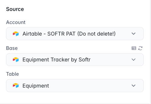
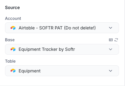
Linking an Airtable base and table
Conditional Filters
Under the Source tab, you also have the Conditional Filters section. Chart Conditional Filters work similar to List conditional filters.Features
Now, let’s see what we have in the Features tab of block’s settings.Title and Subtitle
Type
Next, you have the Type parameter where you select between different chart types. Let’s select the Bar Chart type and move on to configuring our data.Metrics
As you can see, each record has a Type field, a Sub-type, and a corresponding value, which is negative in case of expenses. Let’s say we want to display the sum of incomes and expenses for each month. For that, we have to define what is our metric. In our case incomes and expenses are stored in Airtable Value field, and the metric should be a sum of those. The Aggregate function has the following options:- Sum. Calculates the Sum of all the values for a given category.
- Average. Calculates the average of all the values for a given category.
- Min. Picks the smallest value of all the values of the category.
- Max. Picks the biggest value of all the values of the category.
- Count distinct values. Adds up the number of records that contain a unique value.
- Count all. Adds up the number of records present in a given grouping category.
Groupings
Now, let’s explore each setup option in greater detail. Time interval For the day and month time intervals you can choose relevant display formats:
Sort by
Next, we have the Sort by dropdown, which will have the following options:
- Categories // A-Z. Order by the Category field values from A to Z.
- Categories // Z-A. Order by the Category field values from Z to A.
- Values // A-Z. Order by the Value field values from A to Z.
- Values // Z-A. Order by the Value field values from Z to A.
Options
Orientation
Show zoom
Show tooltip
When this option is enabled, the users will see a tooltip when hovering over each individual bar. The tooltip contains all the information about that specific bar.Enable download
When this option is enabled, the users will be able to download the chart to their device in .svg format.Data sampling and data freshness
Charts in edit mode
- Data sampling - only a small sample of records is used to generate your charts in edit mode to optimize performance
- Data freshness - data shown in edit mode is real-time.
Charts in preview mode
- Data sampling - all the specified records are being shown, limited by the max number of “records per dynamic block” specified in your plan.
- Data freshness - data refreshes every 15 minutes.
- Charts include the Information about when the data on the chart was last refreshed.
- App builders can instantly refresh data in preview mode. Instant data refresh is only available in preview mode for testing purposes. Not available to your end users in the live app.
Charts in live mode
- Data sampling - all the specified records are being shown, limited by the max number of “records per dynamic block” specified in your plan.
- Data freshness - data refreshes every 15 minutes. Chartsinclude the Information about when the data on the chart was last refreshed.