Common Header Features
Logo
All the Header block layouts have a Logo field that can be removed or changed by clicking on it. You can upload an image or choose one from the library.
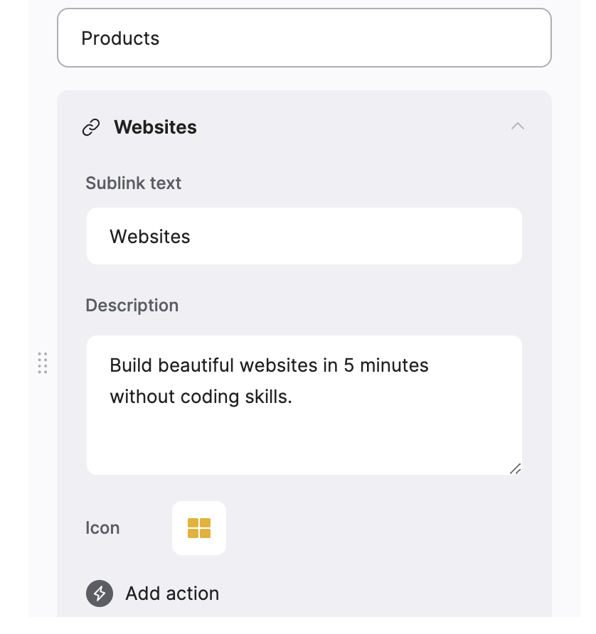
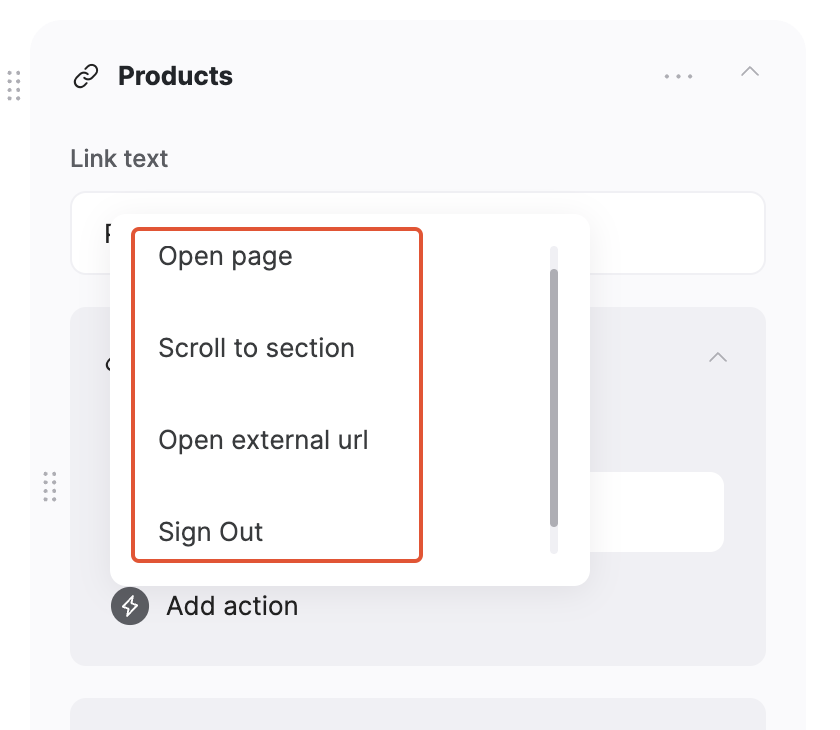
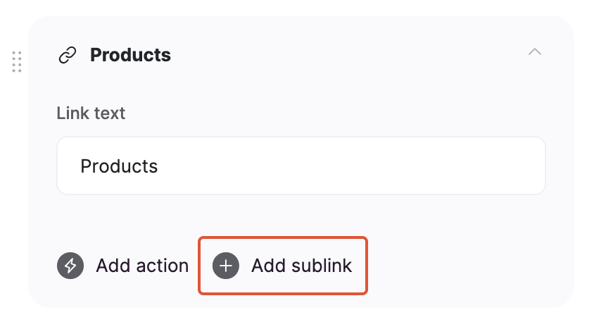
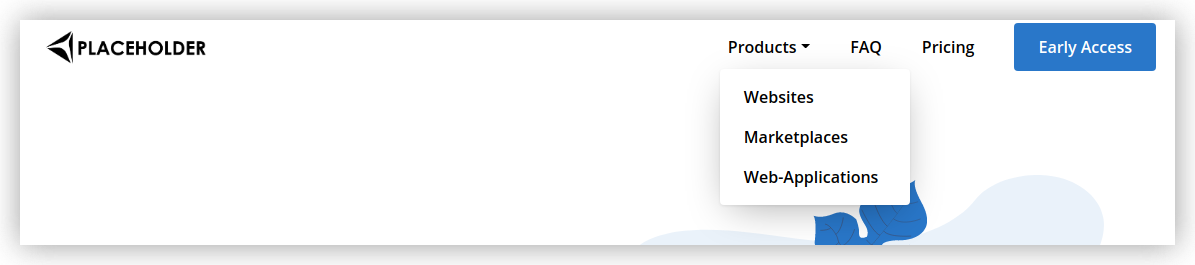
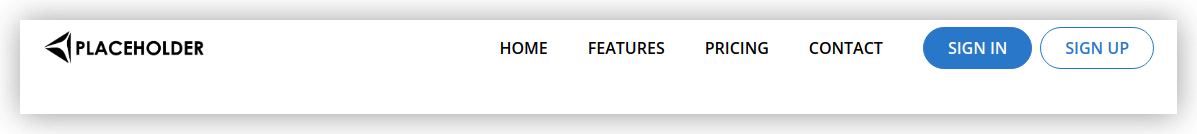
Buttons and links
Apart from the logo, there are Buttons and Links, which can also have Sublinks that appear within a dropdown opened when hovering over or clicking the link. Each layout has certain links and buttons by default, but you can add as many as you wish.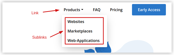
Show User Profile
This option is typically used to show a user profile icon with a dropdown to logged-in users. By default, you have the Sign Out and My Profile links, but you can add as many additional options as needed as well as remove the default ones.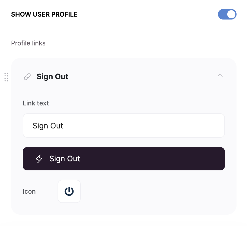
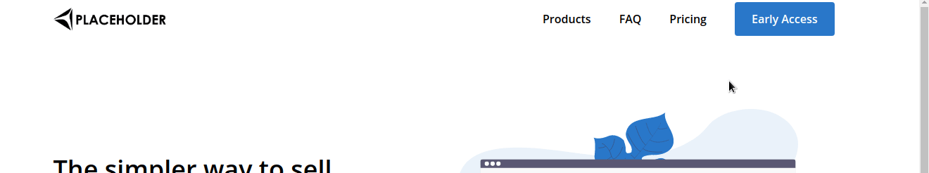
Sticky Header
Lastly, there is the Always show the header on top of the screen option. When enabled, the header will become sticky and will stay on the screen when scrolling down.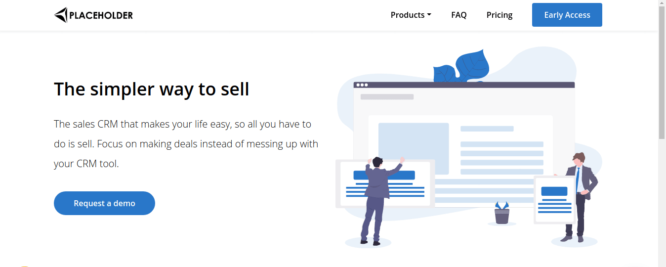
Header Layouts
Header with sublinks and button
Header with links and buttons
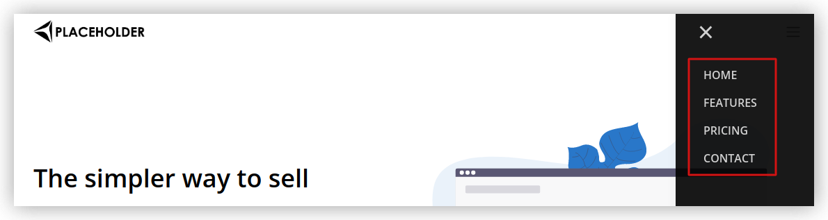
Header with hamburger menu

Header with sublinks, icon and description