Footer Settings
Create navigational footers for pages in your app
A footer sits at the bottom of a page and holds the links that don’t belong in the main menu, such as your Terms of Service, Privacy Policy and social profiles.
Create a footer
Add a footer to a page, then fill it with your links, logo and copyright line.
Open the page's settings
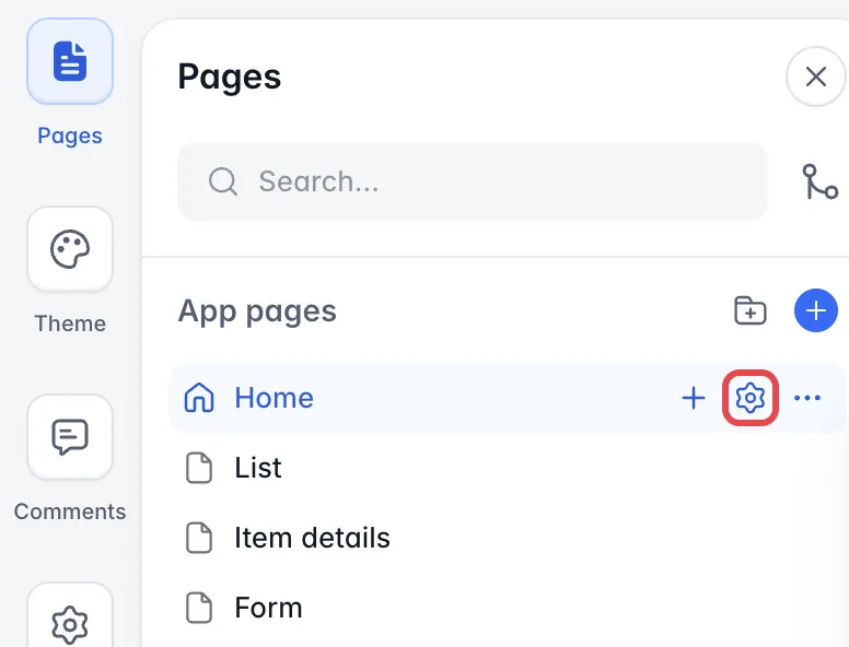
Select Pages in Studio, hover over the page and select the gear icon to open its settings. Then select the Navigation tab.
Select the Footer section
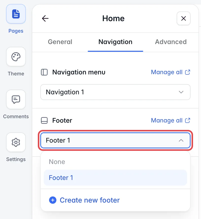
Under Footer, open the dropdown. Choose None to show no footer on this page, select an existing footer, or create a new one.
Create a footer
Select Create new footer. The new footer is added to the current page.
Edit a footer
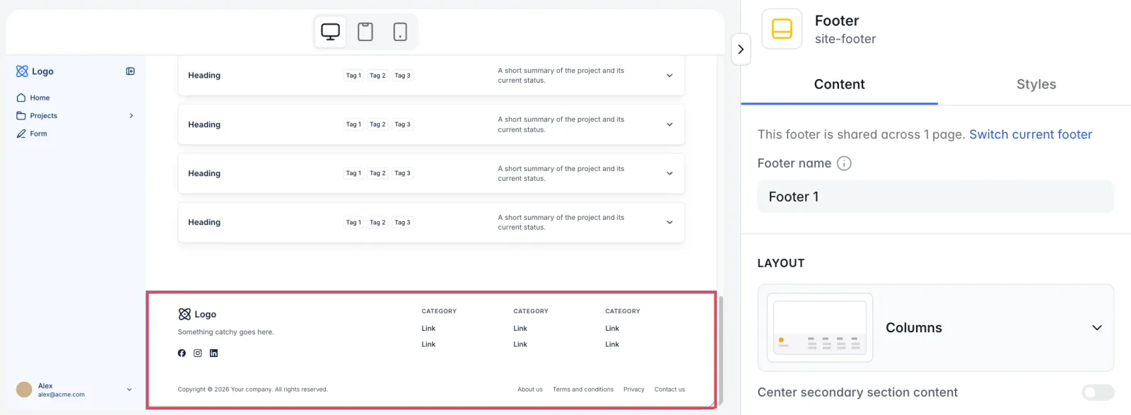
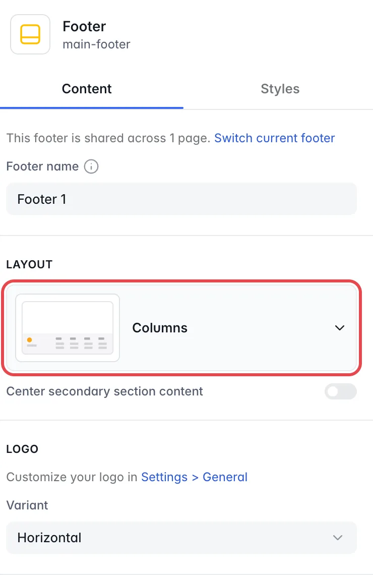
Select the footer on the page. Its settings open on the right, with two tabs, Content and Styles. The Content tab says how many pages share this footer. Switch current footer takes you back to the page settings.
Footer name
Rename the footer in Footer name. This is the name you see when you pick a footer in the page settings.
Layout
Choose Columns or Simple. With Columns, Center secondary section content centers the bottom section, with the copyright line and the Secondary links. With Simple, Center content centers all the content.
Logo
Under Variant, choose the Horizontal or Square version of your logo, or None to hide it. You set the logo itself in Settings > General (see General settings).
Links
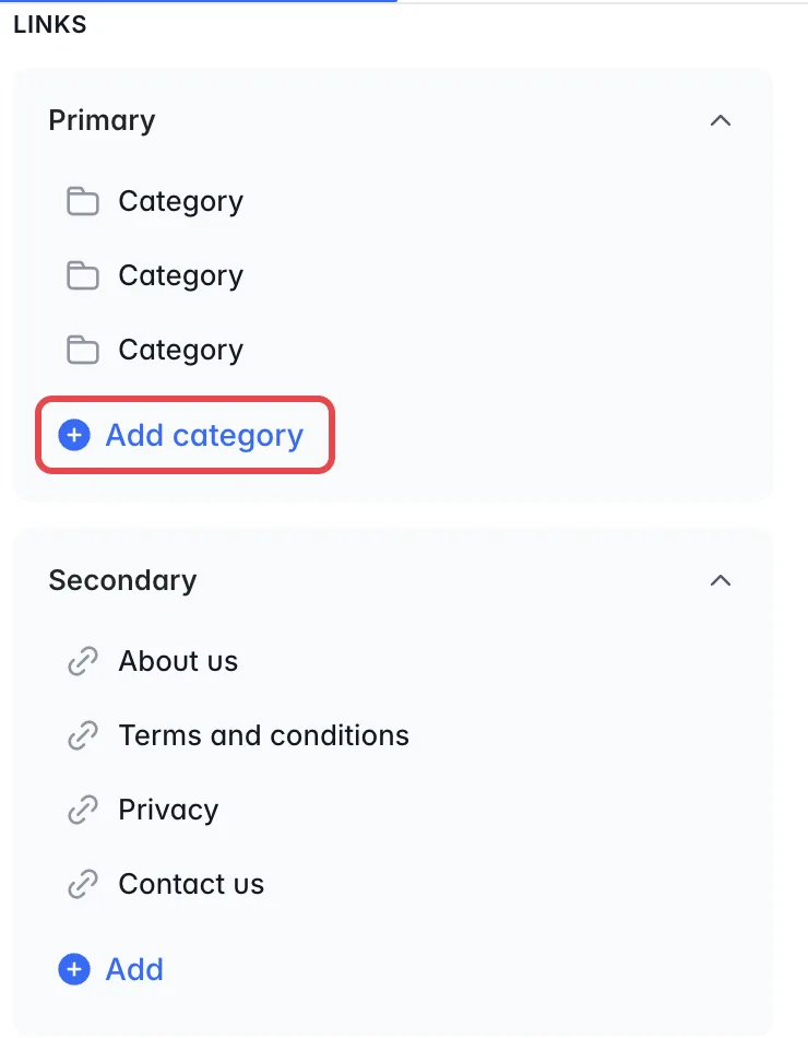
With the Columns layout, links are in two groups, Primary and Secondary. In Primary, select Add category to add a column. Hover over a category and select + (Add item inside) to add a link to a page or an external URL. In Secondary, select Add to add a link.
With the Simple layout, there is one list of links. Select Add to add a link.
Select a link or category to rename it. Hover over it and select the trash icon to delete it. To reorder links, drag them up or down.
Social links
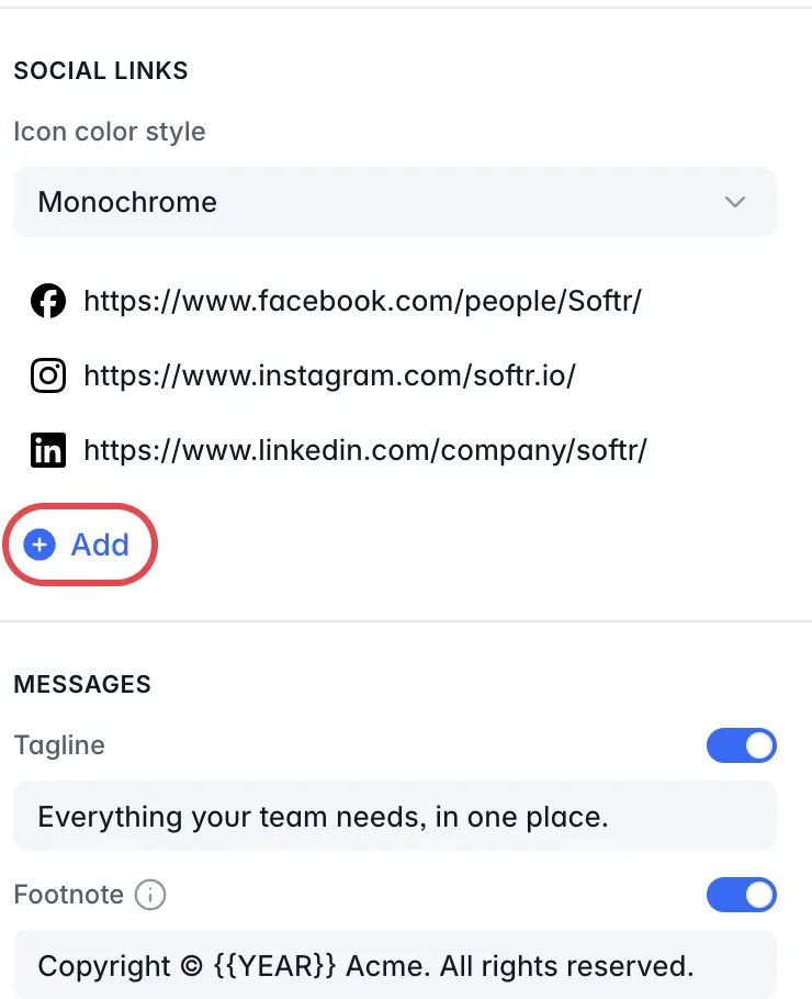
Under Icon color style, choose Monochrome or Colored icons. Select Add and pick a platform to add a social link, or select Custom to upload your own icon. Select a social link to change its Icon and URL. To delete a social link, hover over it and select the trash icon. To reorder social links, drag them up or down.
Messages
Use Tagline and Footnote to add short texts to the footer, for example a slogan and a copyright line. Turn each on or off with its toggle. In Footnote, the placeholder {{YEAR}} always shows the current year.
Styles
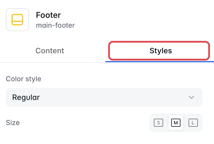
In the Styles tab, Color style sets the footer colors from your app’s Theme: Regular, Gray, Accent or Soft accent. You can also set the Size.
For more control, use custom code.
Manage footers
All footers of the app are listed in one place, where you can delete the ones you no longer use.
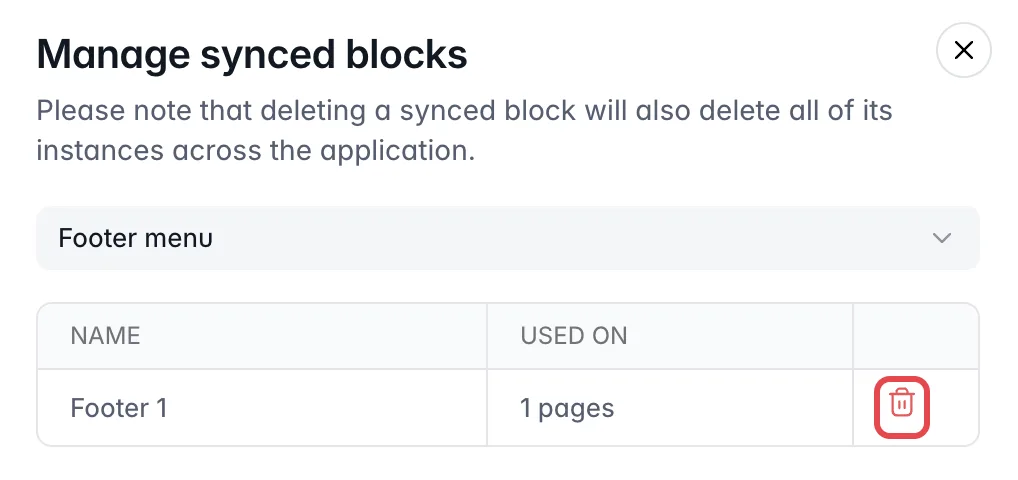
In Pages, hover over a page, select its gear icon and open the Navigation tab. Manage all, next to Footer, opens the Manage synced blocks dialog. It lists every footer with the number of pages it is used on. Delete a footer there with the trash icon, and it is removed from every page that uses it.
Adjust the visibility of footer links
You can show each link or category only to certain user groups or devices, for example hide a sign-up link from users who are already logged in.
Select the footer on the page. In the Content tab, hover over a footer link or link category and select the branching icon.

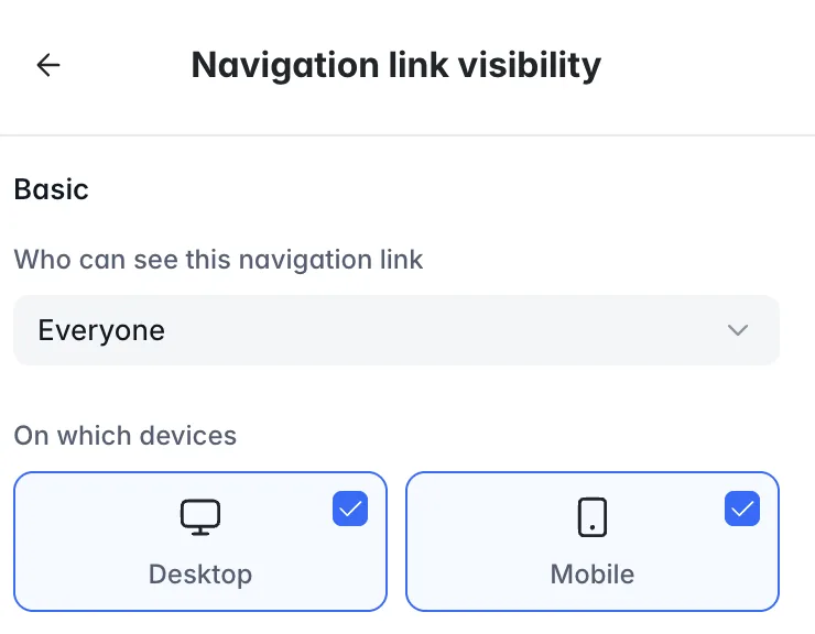
Under Who can see this navigation link, choose which users see the link or category. Under On which devices, choose Desktop, Mobile or both.