Block types
An overview of the different types of blocks and how they shape your application:Dynamic blocks
Dynamic blocks pull data from data sources (e.g., Airtable, HubSpot, SQL) and display information that updates in real-time based on data changes or user inputs.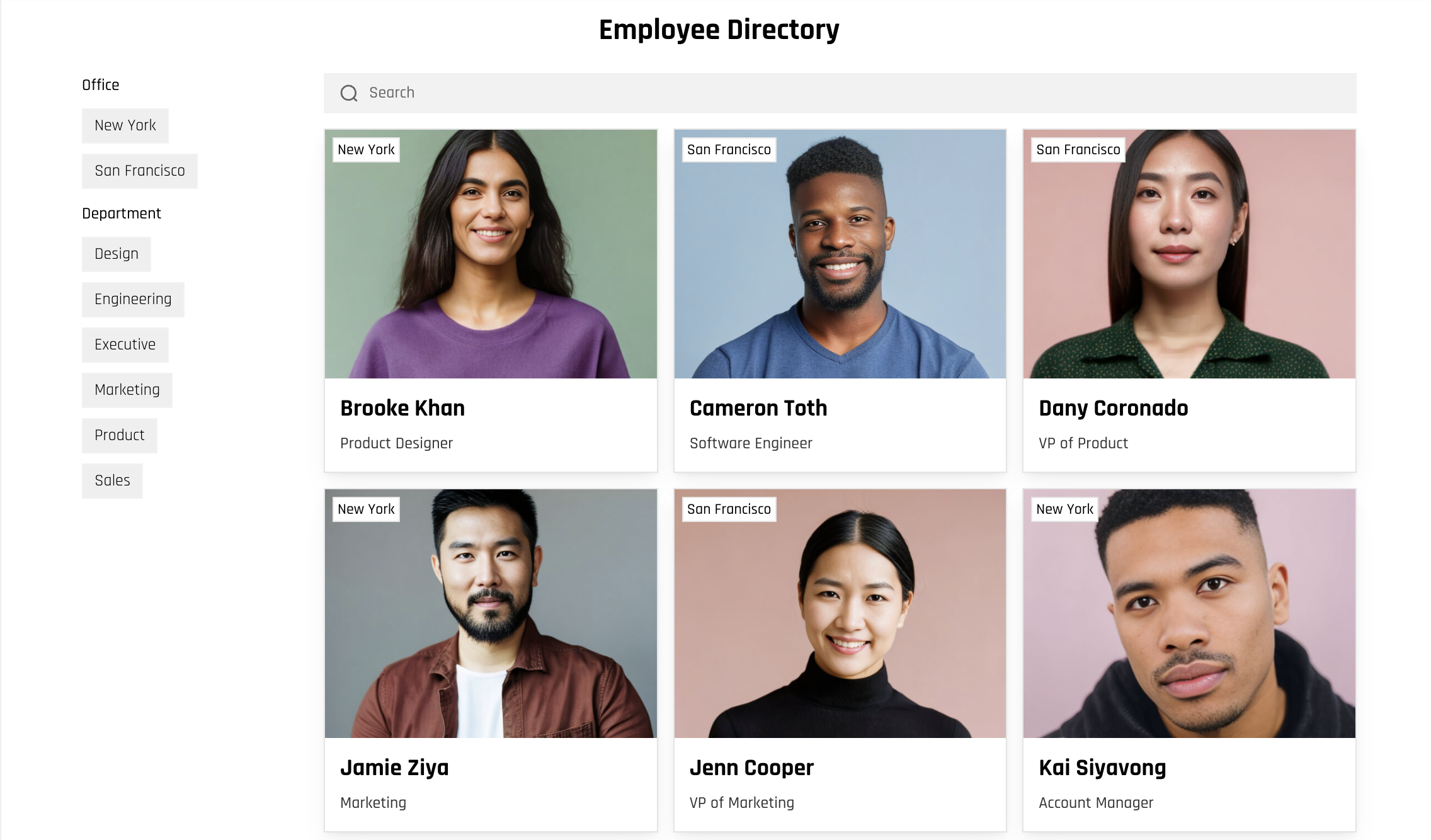
- List block: Displays a collection of items, such as products or team members, as a searchable and filterable list.
- Table block: Displays data in a structured table format with options for users to search, create, and delete records.
- Calendar block: Displays date-specific items, such as events or appointments, in a calendar format. Users can view, schedule, and edit events.
- Data source: Choose where the block gets its data from, like a spreadsheet or database. You can also decide which users see what data with conditional filters, sort the information, and set a message to show if there’s no data.
- Content: Pick how your data appears, like showing names, dates, or images. The options depend on the type of block you’re using.
- Actions: Decide what users can do, like clicking to see more details, editing items, or starting a workflow.
- Style: Adjust the look of the block—change fonts, colors, spacing, and more to match your style.
- Visibility: Control who can see the block and whether it shows up on desktop, tablet, or mobile.
Static blocks
Static blocks display the same content to all users and can be updated manually in Softr. For example, image, text and copy on the block remain consistent until you change it in the softr app.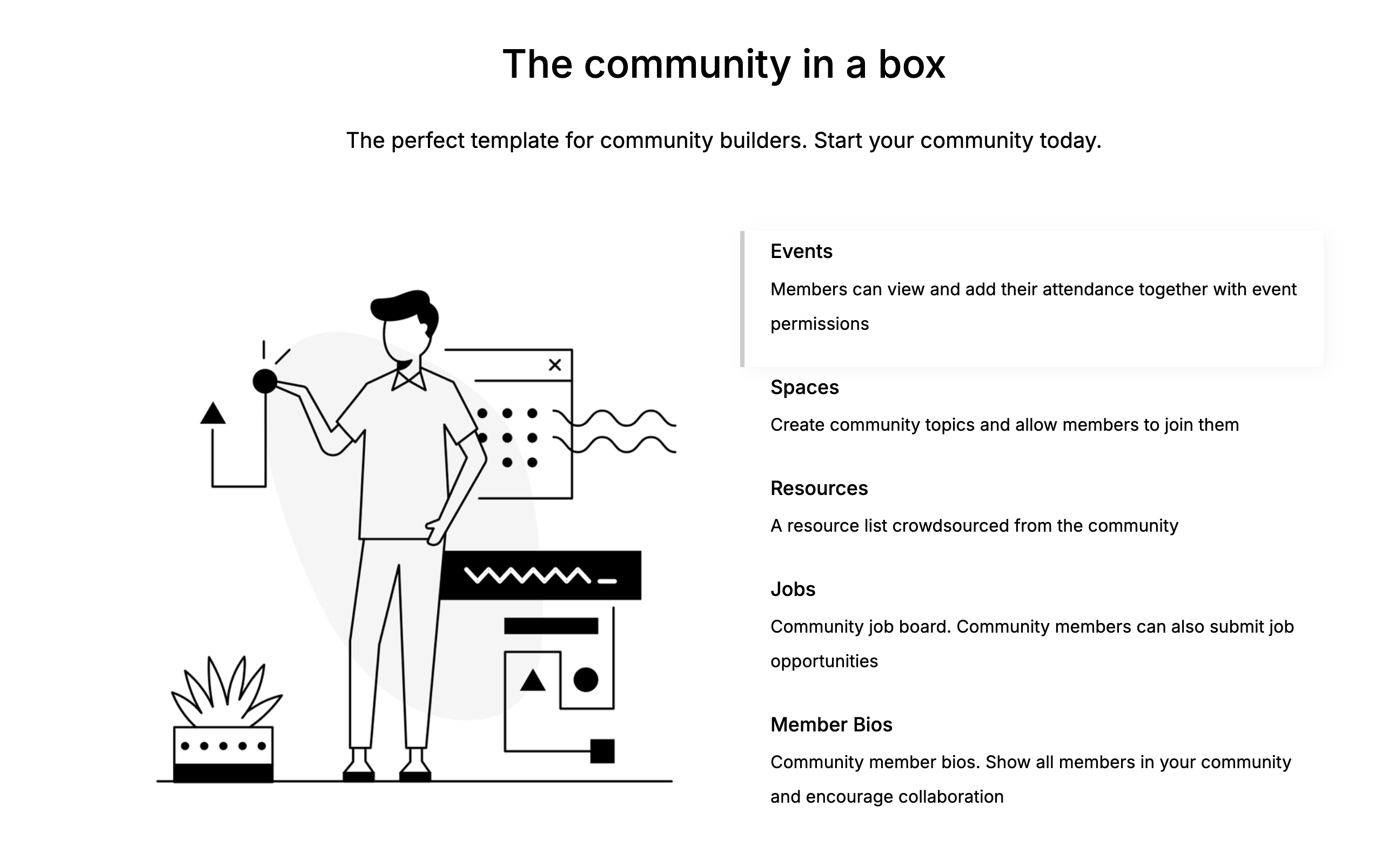
- Hero: Used as a headline or introductory banner for a page.
- FAQ: Displays frequently asked questions and answers.
- CTA (Call to Action): Encourages users to take specific actions, like signing up or contacting support.
- Core elements: Edit key components like the layout, headings, and subheadings. The available options depend on the block type.
- Visibility: Choose who can see the block and where it appears in your app.
Container blocks
Container blocks group and organize other blocks to provide arrangement and layout options.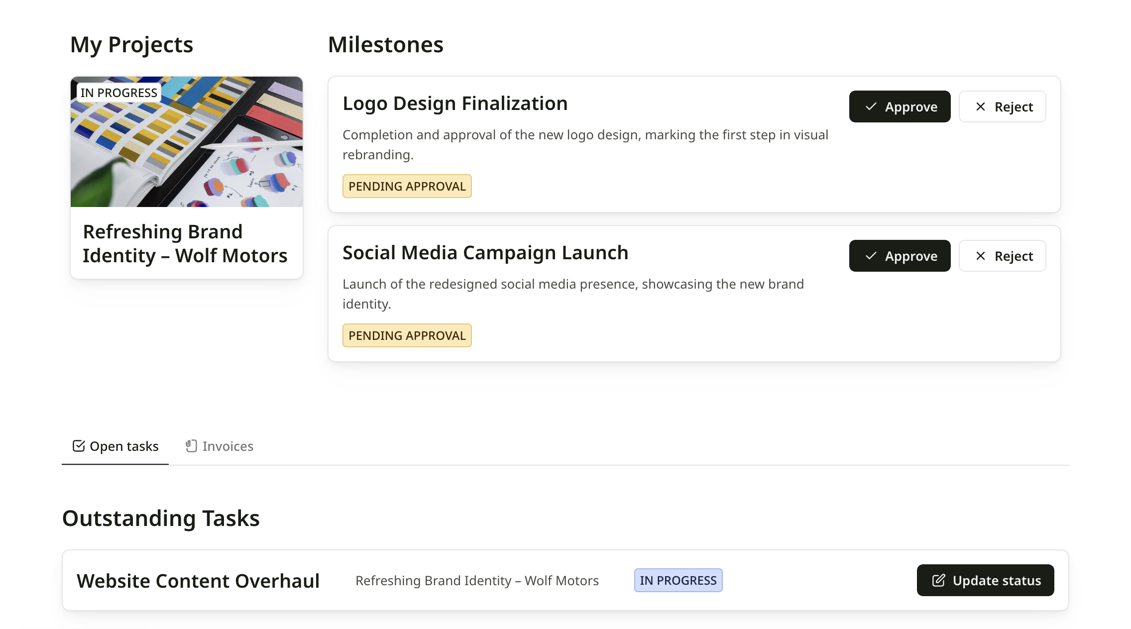
- Tabs: Divide content into tabbed sections that users can switch between. For example, organizing product details, specifications, and reviews in separate tabs.
- Columns: Displays content side-by-side to create various multi-column layouts. For example, it allows you to place charts side-by-side in a dashboard.
- Layout: Adjust the overall structure, including layout, headings, and subheadings. Options depend on the container type.
- Blocks: Decide which blocks are displayed within the container.
- Visibility: Control who can see the container and its content.
Add a block
You can add blocks manually or let the AI Co-Builder do it for you. Option 1: Build with AI Open the AI Co-Builder chat in the editor and describe what you need. For example: “Add a Kanban board showing my Tasks sorted by status” or “Create a pricing table with three tiers”. The AI will instantly generate and configure the appropriate block on your page. Option 2: Add manually- Click the + icon in the top-right corner of the canvas. This opens the blocks library in the right-hand panel.
-
Browse the available dynamic, static, or container blocks and click the one you want to add to your page.
- A placeholder layout will appear, ready for you to customize.
- Click on the block in the canvas to edit it.
Manage blocks
Hover over a block to reveal icons in the top-right corner. Use these options to manage the block:- Move a block: Click the ↑ up or ↓ down arrow icons to move the block up or down on the page.
- Duplicate a block: Click the duplicate icon to create a copy of the block on the same page.
- Copy a block to another page or application: Click the Copy to icon and select the page where you want the block to appear.
- Change block layout: You can switch the block layout to another one. (Available for Lists, Grid, Table, Calendar blocks)
- Hide a block: Click the hide icon to temporarily remove the block from view while keeping its content and settings intact.
- Delete a Block: Click the delete icon to permanently remove the block from your page.
Tip: Hide a block you’re still working on to save it as a draft while you update other parts of your app.