This is a simple block with some text and one or more CTA buttons that accomplish certain actions. The block has a Title, Subtitle, and a Button(s).Documentation Index
Fetch the complete documentation index at: https://docs.softr.io/llms.txt
Use this file to discover all available pages before exploring further.

Common Block Features
Title, Subtitle, and Background Image
These settings are located under the Features tab of block settings, and here you customize the Title and Subtitle texts and can add a Background Image for the whole block.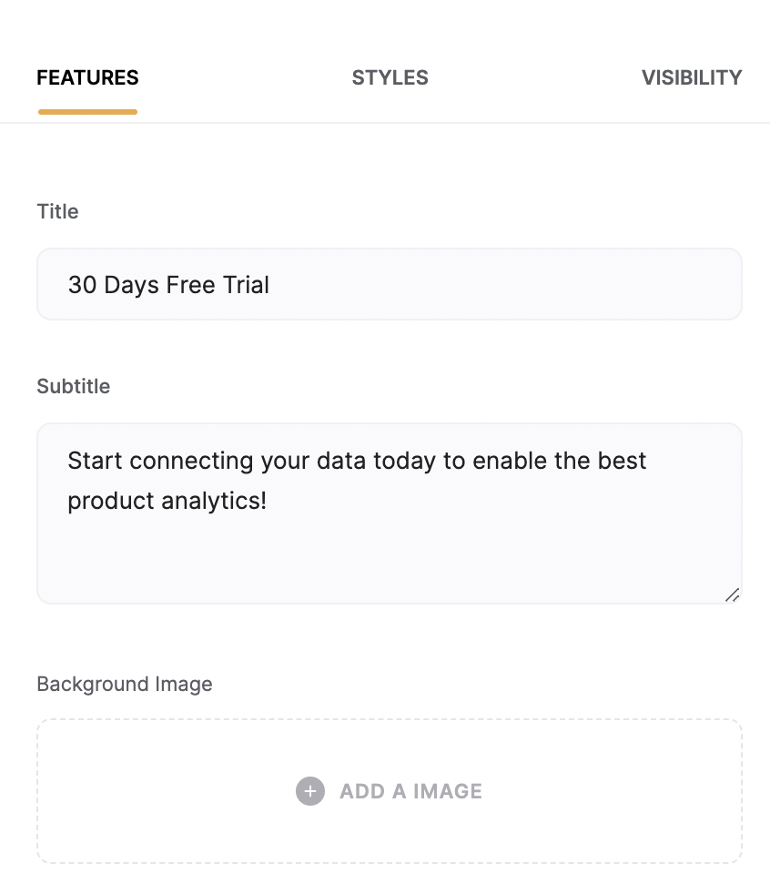
Button
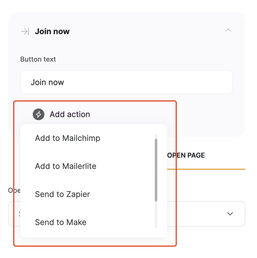
By default, there’s only one button, but you can use the Add Button option to add more buttons.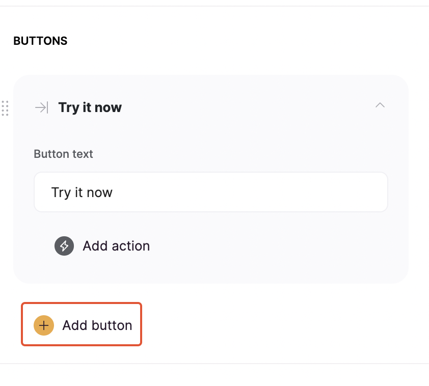
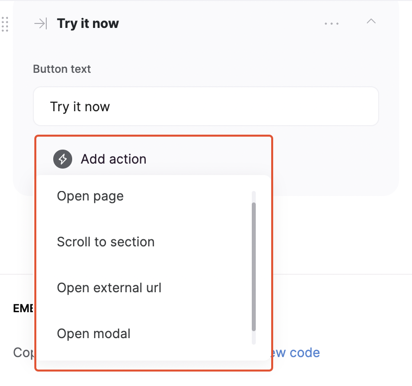
- Open page to open another page within the app;
- Scroll to section to scroll to a specific section within the page;
- Open external url;
-
Open Modal to open another page within a pop-up.
CTA Block Layouts
Layout: Call to action with a button

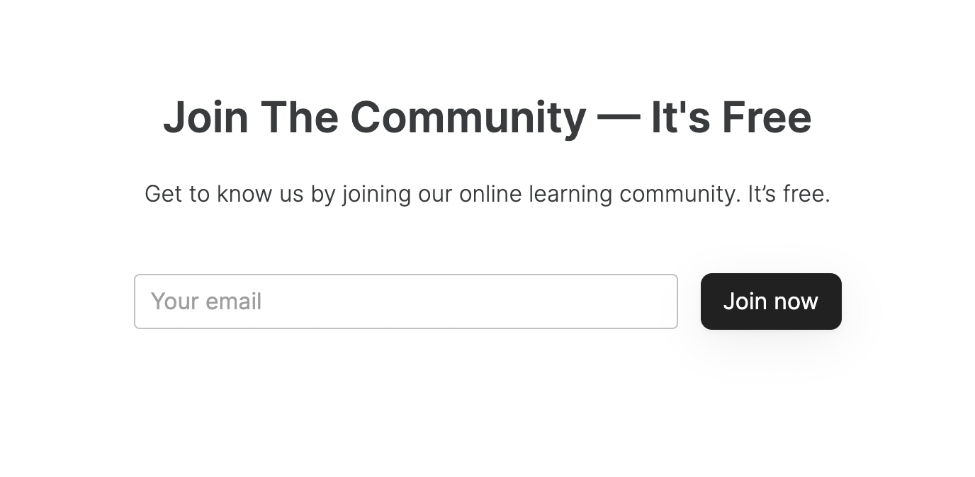
Layout: Call to action with email capture
Layout: Call to action with a button on the right
This layout is similar to the Call to action with a button but the button is positioned on the right hand.
Layout: Call to action with a text and action button
