Documentation Index
Fetch the complete documentation index at: https://docs.softr.io/llms.txt
Use this file to discover all available pages before exploring further.
Pie Chart is a circular graphic that is divided into slices to show numerical proportion. The setup of the Pie Chart block is similar to that of the Bar Chart described here, but there are some differences related to the unique characteristics of this chart type, which we’re going to discuss here.
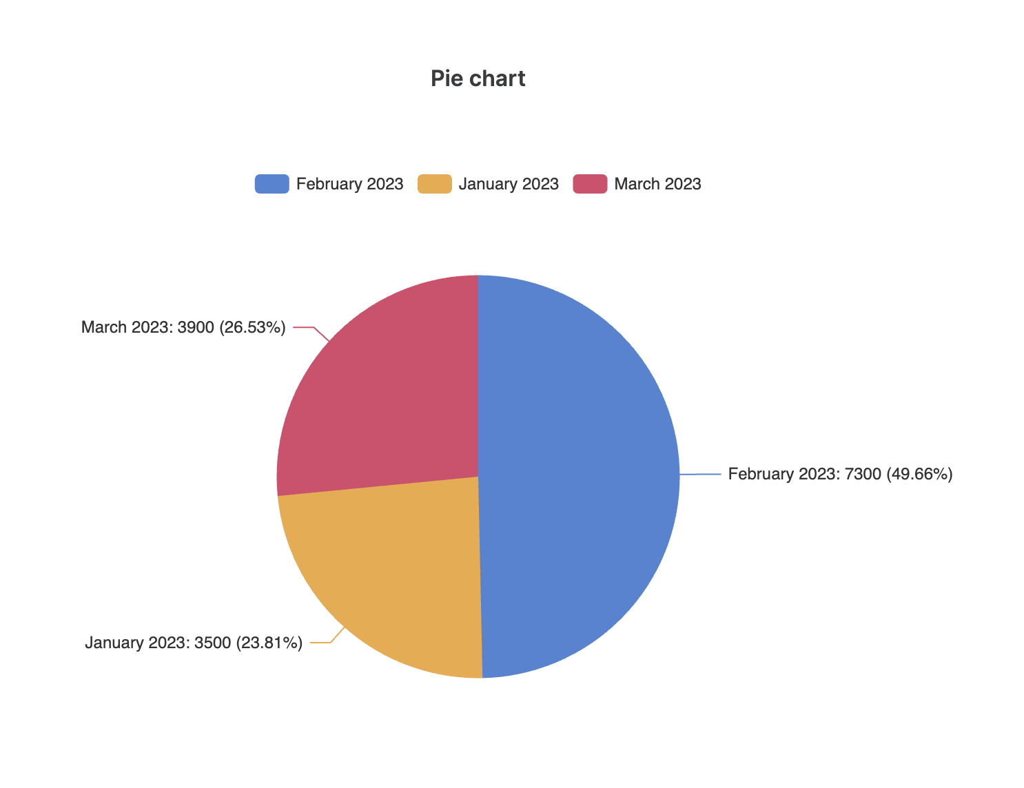
The following image illustrates a pie chart that uses the same the income/expense data from Airtable we used in our chart block overview.
We’ve used the same Sum aggregate function, and we can see that each slice shows the sum of incomes and expenses for a given month, and what’s the proportion of each slice (e.g. 23.81% for January). At the top of the chart, there’s the Legend section, which indicates which color corresponds to which record or group of records. So, let’s see how the Legend is configured.
Chart legend
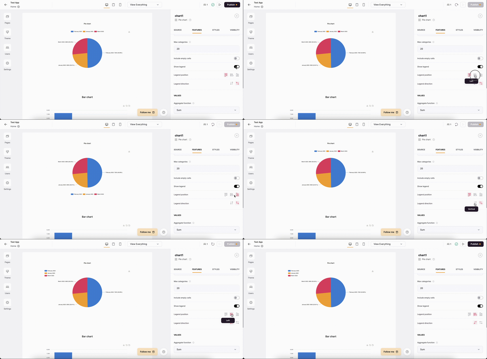
First of all, you can choose whether you want to display a Legend or not. If the toggle is enabled, you can change the Legend position as well as switch the Legend direction between vertical and horizontal options.

