Navigation settings
Customize navigation of your app.
Navigation is the menu your users move around your app with: links to your pages, buttons, and a user menu for their account. You choose which pages show it and what it holds.
Set up page navigation
A page shows one navigation menu or none. You can create several menus and choose which pages each one is on.
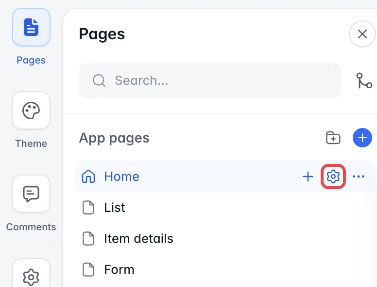
To choose the navigation menu of a page, select Pages in Studio, hover over the page and select the gear icon to open its settings. Then select the Navigation tab.
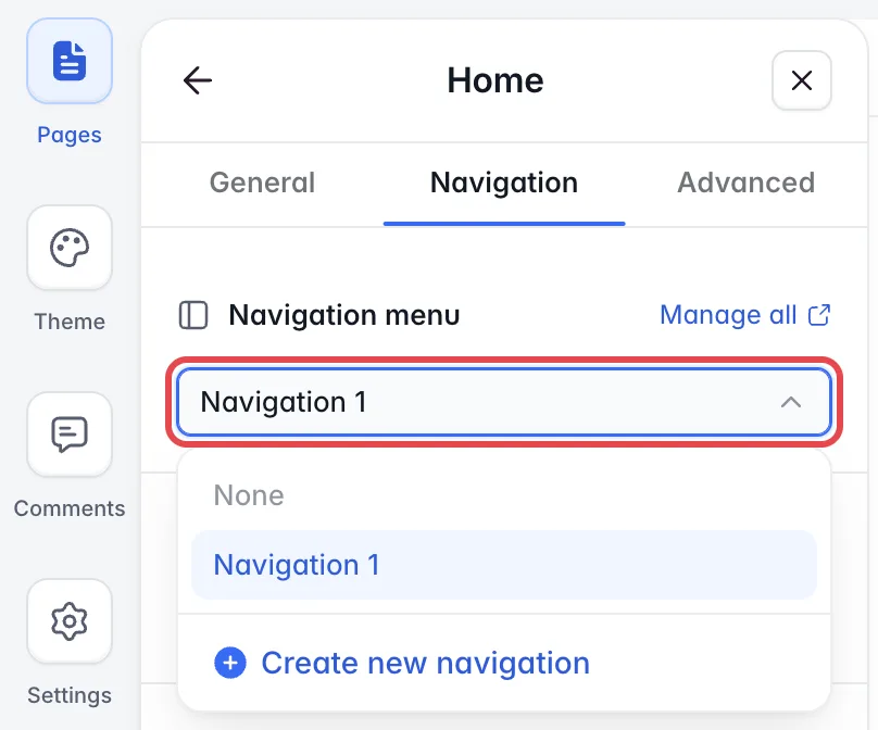
Under Navigation menu, pick None to show no navigation on the page, pick an existing navigation menu, or select Create new navigation. A navigation menu you create can be used on other pages too.
Manage all opens the Manage synced blocks dialog. It lists every navigation menu with the number of pages it is used on. Delete one there with the trash icon, and it is removed from every page that uses it.
Edit the navigation
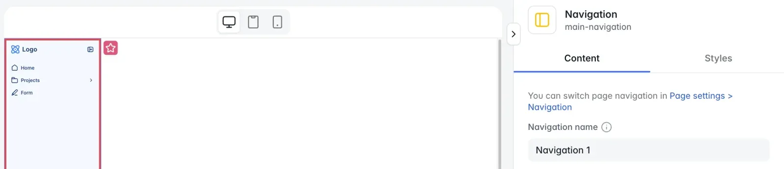
Select the navigation on the page. Its settings open on the right, with two tabs, Content and Styles. What you change here applies to every page that uses this navigation menu.
Content
The Content tab sets what is in the menu. It starts with the Navigation name, an internal name you see in the page settings.
Layout
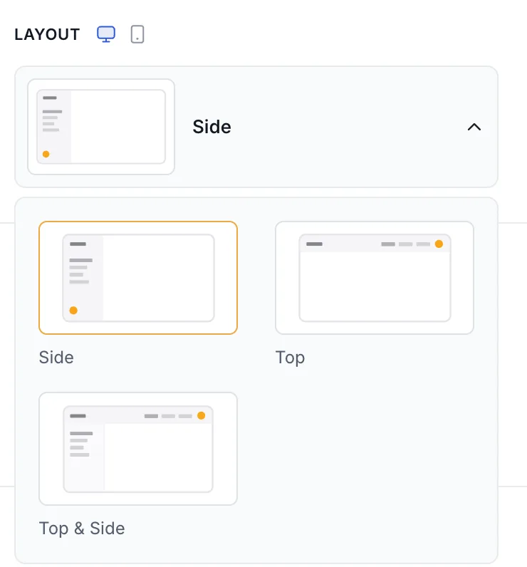
On desktop, choose Side, Top or Top & Side. On mobile, choose Bottom, Top or Top & Bottom. Switch between the desktop and mobile layout with the device icons next to the section title. The Layout, Logo, Links and Buttons sections each have these icons.
Logo
Under Variant, choose the Horizontal or Square version of your logo. You set the logo itself in Settings > General.
Links
Links take your users to pages in your app or to external websites. With Top & Side, the links are in two groups, Top and Side. With Top & Bottom, they are in Top and Bottom. With the other layouts, they are in Primary and Secondary.
Select Add in a group and choose Page, Category or External URL. A category groups links under one entry. Hover over it and select + (Add item inside) to add a link to it. To reorder links, drag them up or down.
Depending on the layout, the section also has these settings:
- Show hierarchy tree lines draws lines under expanded categories in the sidebar.
- Show icons shows an icon next to each link.
- Position aligns the links in the top bar.
- Show labels shows the link names in the bottom bar on mobile.
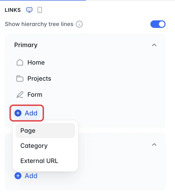
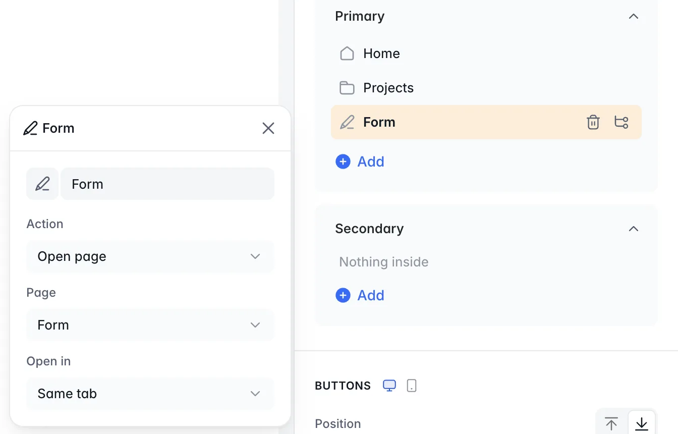
Select a link to set its name, its icon, its Action (for example Open page, then the Page) and Open in. In a top bar on desktop, a top-level category also has a Sub-menu style (Simple dropdown, Tabs or Mega menu), and links inside a mega menu can have a Subtitle.
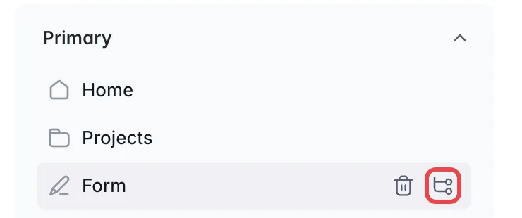
To choose who sees a link or category, hover over it and select the branching icon.
Pick the user groups under Who can see this navigation link and the devices under On which devices: Desktop, Mobile or both.
Buttons
Buttons work like links, but have a background. Select Add and choose Page or External URL. Buttons cannot be grouped in categories. Show icons shows an icon on each button. In the sidebar, Position places the buttons above or below the links.
User menu
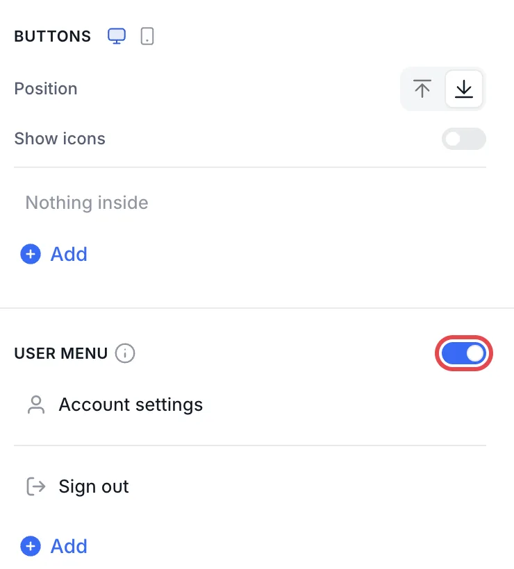
The user menu opens when a logged-in user clicks their avatar. Turn it on with the toggle next to User menu. It always has Account settings and Sign out, which you cannot delete. Select Add to add more pages or external URLs to it. We recommend turning on the user menu if your app has sign-in.
Notification inbox
If your app uses the notification center, choose where the inbox appears under Display as: Primary link, Secondary link, User menu or Standalone icon. For a link, Order puts it First or Last. The settings need the user menu turned on and In-app notifications turned on in Users > Notifications. Until both are on, the section shows a message saying which one is missing.
Styles
The Styles tab sets the menu’s colors, size and roundness, separately for Desktop and Mobile.
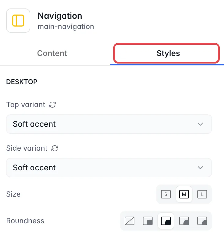
Each part of the navigation has its own variant: Top variant and Side variant on desktop, Top variant, Drawer variant and Bottom variant on mobile. The colors come from your theme:
-
Default uses the variant set for navigation in the Theme panel.
-
Regular uses the background colors of the theme.
-
Accent uses the accent color of the theme.
-
Soft accent uses a lighter shade of the accent color.
-
Surface uses the theme’s surface color.
You can also set the Size and the Roundness.