Summary Cards
Summarize your data through cards.
This block is for displaying data from a data source in a specific format that's suitable for summaries, key stats, and similar. So, let's go through the block settings and see how it works.
Conditional Filters
You can learn more about conditional filters here.
Summary Options
In this section, you can customize the Title and Subtitle of the block.
Summary Card
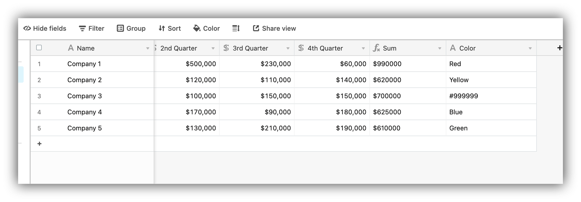
This is where you customize the layout of the summary card and map the fields from your data source. So, let's see how this works on a practical example. Let's say you have an Airtable table with quarterly revenue data for a number of companies, and you want to summarize the annual revenue of each company on your Softr app. Below you can see our table, where we have added a Sum formula field that calculates the annual revenue based on data from each quarter. We also have the names of the companies and a Color field, which we are going to use to apply different colors to each summary card.
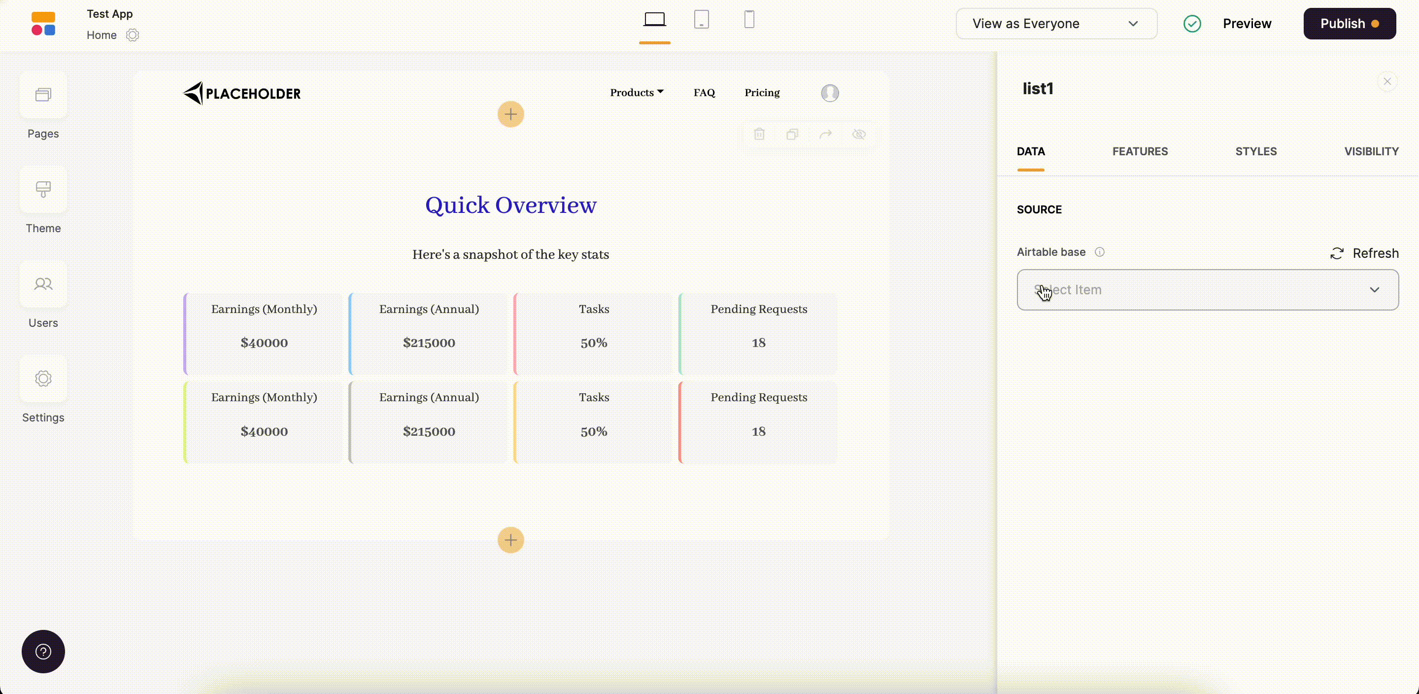
Finally, let's connect the data to our Summary block and set it up.
Last updated on February 28, 2023