> ## Documentation Index
> Fetch the complete documentation index at: https://docs.softr.io/llms.txt
> Use this file to discover all available pages before exploring further.

# Type: Stacked Bar Chart

> Chart type overview.

<Note>Stacked bar chart block is available for users on the [Professional plan and above](https://www.softr.io/pricing).</Note>

The Stacked Bar chart layout allows you to compare data in a part-to-whole manner, over time or across categories.

The setup is similar to that of a [Bar Chart](/building-blocks/vikC2AWEpQGkZd4jGyoVxo/type-bar-chart/hs9Nn3rYv1PJFoJADwMWk6) with a unique feature: it allows the presentation of subcategories within a single bar (stacked), as opposed to showing each subcategory with a separate bar.

## Example

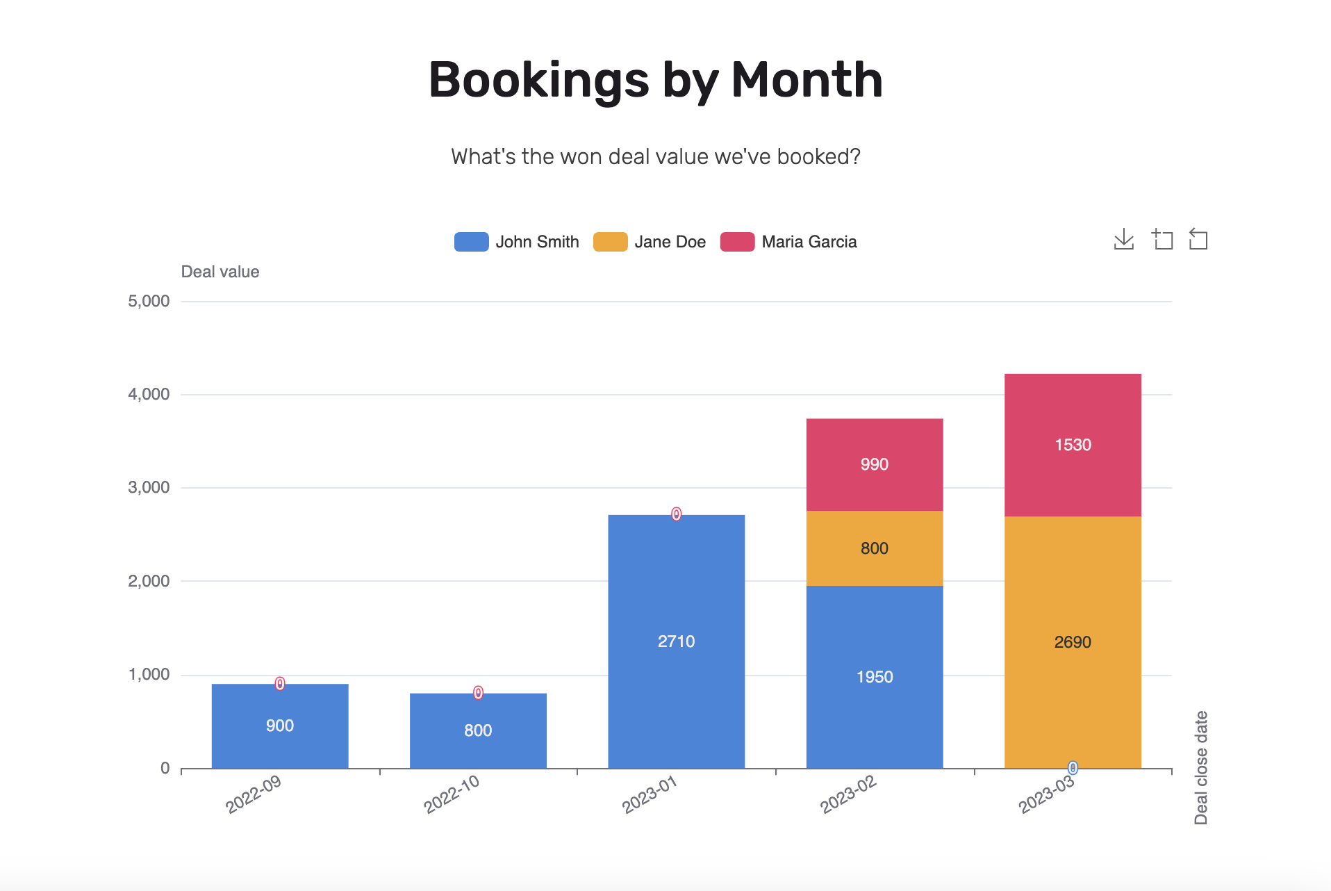
Let’s say you are a sales manager and you want to analyze bookings by month, split by deal owners. You want to both understand what is the total sum of won deals, as well as how each sales person (deal owner) contributed.

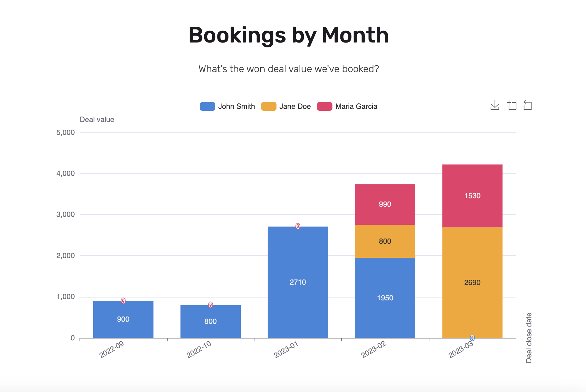
Here is the output chart we aim at preparing:
<Frame>
  <img src="https://mintcdn.com/softr-2b8a27e1/90CuYCwl_tachktl/building-blocks/images/type-stacked-bar-chart/image1.png?fit=max&auto=format&n=90CuYCwl_tachktl&q=85&s=512ace28adb642d622af22193e80b890" alt="Notion image" width="1916" height="1282" data-path="building-blocks/images/type-stacked-bar-chart/image1.png" />
</Frame>

**Setting up the chart**

Take a look at the Airtable base example. It has different deals at different sales stages, close dates and deal owners.
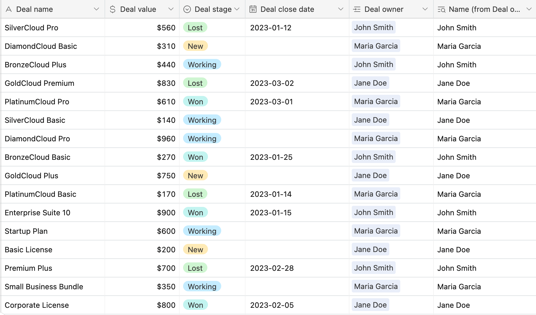
<Frame caption="Airtable base with sales information">
  <img src="https://mintcdn.com/softr-2b8a27e1/90CuYCwl_tachktl/building-blocks/images/type-stacked-bar-chart/image2.png?fit=max&auto=format&n=90CuYCwl_tachktl&q=85&s=2ea7a32923c8d8ea155b84f26242dadf" alt="Airtable base with sales information" width="1856" height="1090" data-path="building-blocks/images/type-stacked-bar-chart/image2.png" />
</Frame>

Having a base, let’s add a Stacked Bar Chart block, and configure it.

<Columns cols={2}>
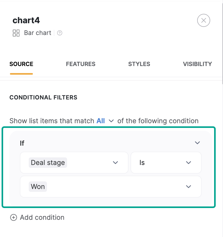
  <p>**Conditional filters** – let’s take into account only the deals with a Deal stage: Won</p>

  <Frame>
    <img src="https://mintcdn.com/softr-2b8a27e1/90CuYCwl_tachktl/building-blocks/images/type-stacked-bar-chart/image3.png?fit=max&auto=format&n=90CuYCwl_tachktl&q=85&s=e3c62306bd5a3b7cb2133ef84d370ff1" alt="Notion image" width="854" height="908" data-path="building-blocks/images/type-stacked-bar-chart/image3.png" />
  </Frame>
</Columns>

<Columns cols={2}>
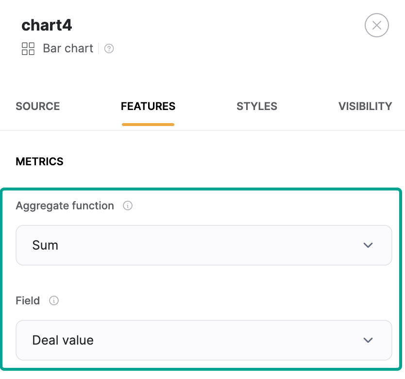
  <p>**Aggregate function** – we want to SUM all the deal values</p>

  <Frame>
    <img src="https://mintcdn.com/softr-2b8a27e1/90CuYCwl_tachktl/building-blocks/images/type-stacked-bar-chart/image4.png?fit=max&auto=format&n=90CuYCwl_tachktl&q=85&s=761df6bef22d06619bd07b2c6f8182ff" alt="Notion image" width="834" height="782" data-path="building-blocks/images/type-stacked-bar-chart/image4.png" />
  </Frame>
</Columns>

**Groupings**

<Columns cols={2}>
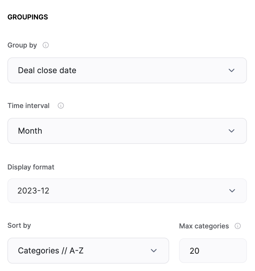
  <p>Then we want to group these won deal values by the deal close date, with a month time interval →</p>

  <Frame>
    <img src="https://mintcdn.com/softr-2b8a27e1/90CuYCwl_tachktl/building-blocks/images/type-stacked-bar-chart/image5.png?fit=max&auto=format&n=90CuYCwl_tachktl&q=85&s=343f4c041fa6d7d86bf40b46e1239ec7" alt="Notion image" width="826" height="878" data-path="building-blocks/images/type-stacked-bar-chart/image5.png" />
  </Frame>
</Columns>

<Columns cols={2}>
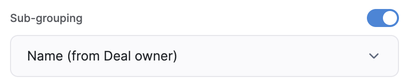
  <p>Finally, we want to further group the data by deal owners →</p>

  <Frame>
    <img src="https://mintcdn.com/softr-2b8a27e1/90CuYCwl_tachktl/building-blocks/images/type-stacked-bar-chart/image6.png?fit=max&auto=format&n=90CuYCwl_tachktl&q=85&s=2df41254bab49b022f24b76cfaf30b73" alt="Notion image" width="824" height="166" data-path="building-blocks/images/type-stacked-bar-chart/image6.png" />
  </Frame>
</Columns>

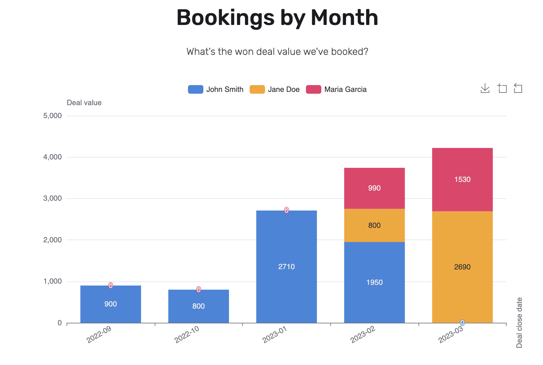
The Stacked Bar Chart block is ready:

<Frame>
  <img src="https://mintcdn.com/softr-2b8a27e1/90CuYCwl_tachktl/building-blocks/images/type-stacked-bar-chart/image7.png?fit=max&auto=format&n=90CuYCwl_tachktl&q=85&s=b2e798366dc49ef162245980c4108b2b" alt="Notion image" width="1916" height="1282" data-path="building-blocks/images/type-stacked-bar-chart/image7.png" />
</Frame>

## Show and hide data point labels

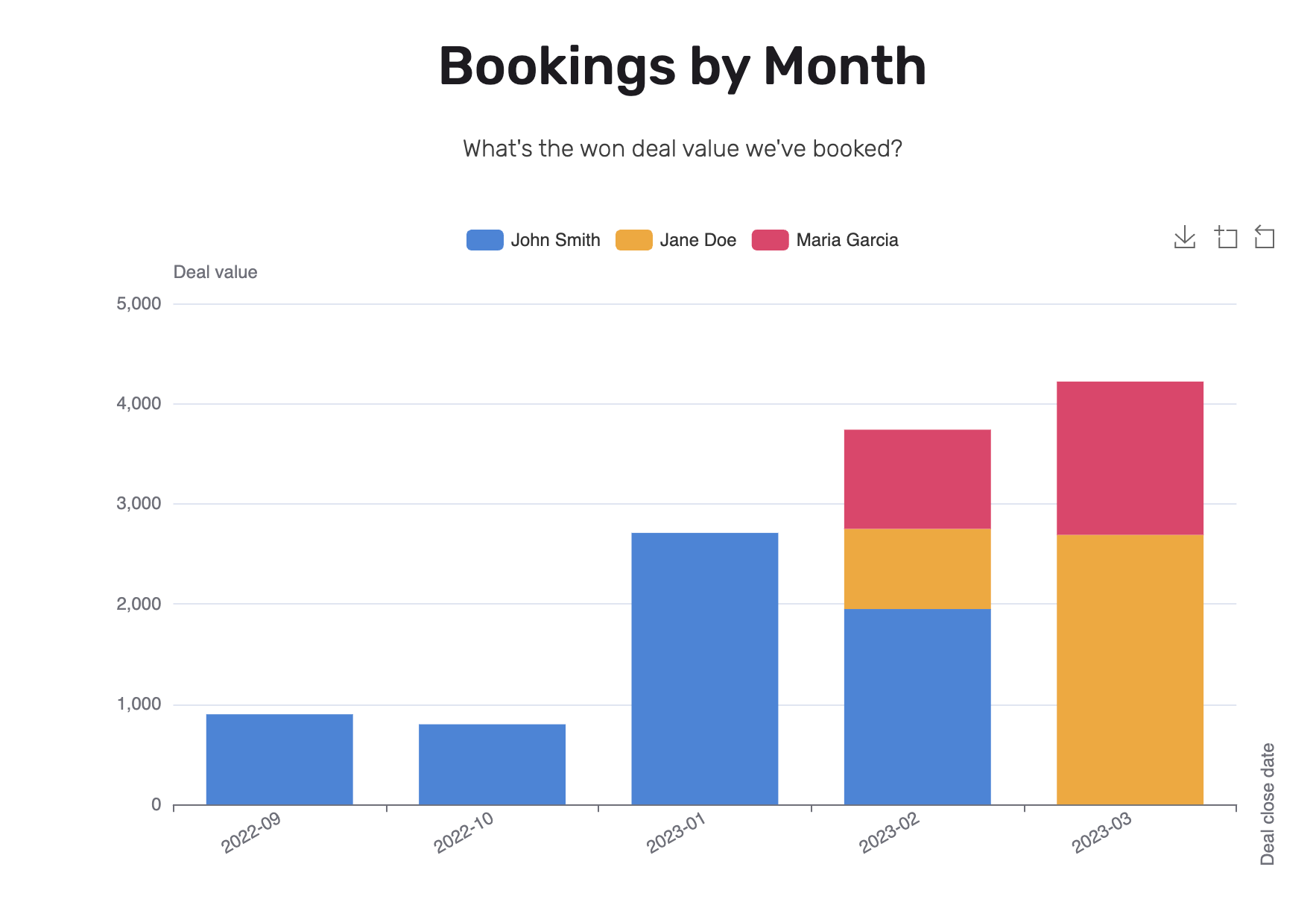
Sometimes labels on stacked bars can look a bit too crowded, so among options shared with other chart types, the Stacked Bar Chart has an additional option to decide whether to show data point labels on stacked bars.
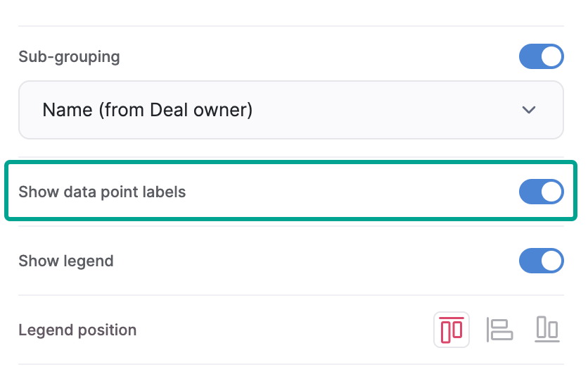
<Frame>
  <img src="https://mintcdn.com/softr-2b8a27e1/90CuYCwl_tachktl/building-blocks/images/type-stacked-bar-chart/image8.png?fit=max&auto=format&n=90CuYCwl_tachktl&q=85&s=0db95dfed137016bd9b08d6cfe8b84cc" alt="Notion image" width="836" height="538" data-path="building-blocks/images/type-stacked-bar-chart/image8.png" />
</Frame>

<Info>Whether the label will be shown or not, a data point **tooltip** still shows up upon hovering over the bars.</Info>

<Frame caption="Show data point labels: ON">
  <img src="https://mintcdn.com/softr-2b8a27e1/90CuYCwl_tachktl/building-blocks/images/type-stacked-bar-chart/image9.png?fit=max&auto=format&n=90CuYCwl_tachktl&q=85&s=2dcb90d95325793d9e0cc843f225dd59" alt="Show data point labels: ON" width="1762" height="1184" data-path="building-blocks/images/type-stacked-bar-chart/image9.png" />
</Frame>

<Frame caption="Show data point labels: OFF">
  <img src="https://mintcdn.com/softr-2b8a27e1/90CuYCwl_tachktl/building-blocks/images/type-stacked-bar-chart/image10.png?fit=max&auto=format&n=90CuYCwl_tachktl&q=85&s=8343cdf59c30a3ffc17d419740895dcd" alt="Show data point labels: OFF" width="1766" height="1206" data-path="building-blocks/images/type-stacked-bar-chart/image10.png" />
</Frame>

<Info>Learn more about setting up charts → [Chart Block Overview](/building-blocks/vikC2AWEpQGkZd4jGyoVxo/chart-block-overview/48LkSKXWY8TrBwjqBVXMqg). </Info>