> ## Documentation Index
> Fetch the complete documentation index at: https://docs.softr.io/llms.txt
> Use this file to discover all available pages before exploring further.
# List Block
> The features of the List block.
**List blocks** display collections of items, like contacts, tasks, or projects, in a list format. They include interactive options that let users filter, sort, or create and update items.
Each item in a List block can show details such as titles, descriptions, images, tags, and other fields.
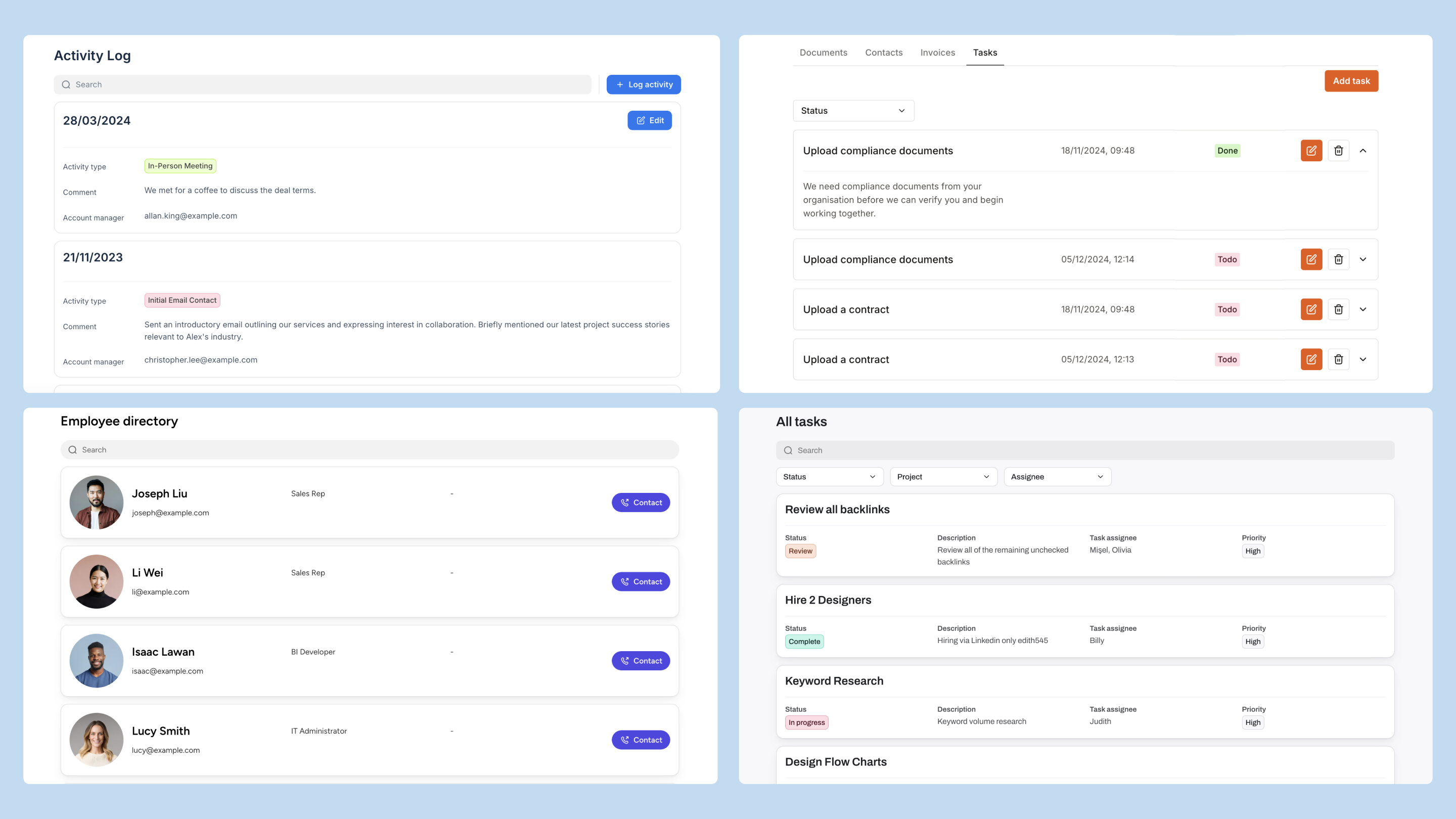 ## **Use case examples**
* **Product Inventory**: Display items in stock with details like product name, SKU, quantity, and location. Users can filter by category or availability to track stock levels.
* **Employee Directory**: Create a searchable list of employees with details like name, position, department, and contact information.
* **Real Estate Listings**: Showcase properties with images, location, price, and property details. Users can filter by property type, location, or price range.
* **Client List**: Organize client information, including industry, location, and project status, to help teams track and access client data.
# Configure a List block
**Build with AI:** Instead of configuring manually, you can add a List block instantly with the **AI Co-Builder**. Just click the AI icon in the editor and type: *"Add a List block showing my team members, including their name, picture, and department."*
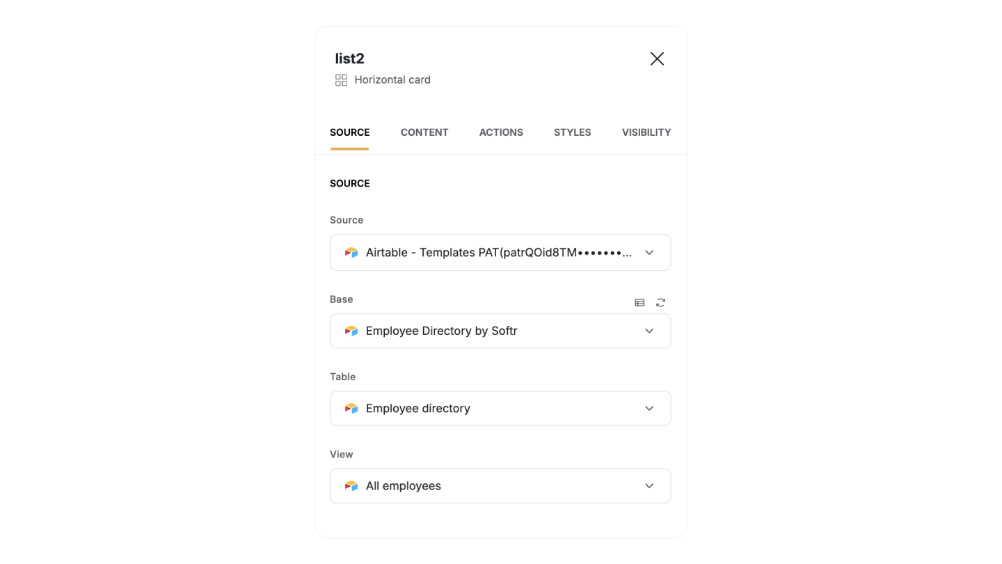
## Source
The **Source** panel connects the list block to your data source. Here, you can:
* Connect the list block to your [data source](/core-concepts-overview/c5VwEbsWtTfPyUZjmEKvfx/connect-your-data-source/41p6U2eZs6NZ5qZp7iKvnn).
* Set up [conditional filters](/user-groups-and-permissions/3oA6AaFzUiePs2sW2TpYrF/conditional-filters/mDnn7jnpPiYmJcT99jpt7m) to display only the data that meets specific criteria.
* **Define sorting rules** and set the number of items to display per page.
* **Customize the empty state message** that appears when no data matches the requirements.
Once you connect to your source data, you can configure Content, Actions, and block Visibility settings.
Some configuration options depend on the [data source](/core-concepts-overview/c5VwEbsWtTfPyUZjmEKvfx/connect-your-data-source/41p6U2eZs6NZ5qZp7iKvnn). For more details, check the documentation for your specific data source.
## **Use case examples**
* **Product Inventory**: Display items in stock with details like product name, SKU, quantity, and location. Users can filter by category or availability to track stock levels.
* **Employee Directory**: Create a searchable list of employees with details like name, position, department, and contact information.
* **Real Estate Listings**: Showcase properties with images, location, price, and property details. Users can filter by property type, location, or price range.
* **Client List**: Organize client information, including industry, location, and project status, to help teams track and access client data.
# Configure a List block
**Build with AI:** Instead of configuring manually, you can add a List block instantly with the **AI Co-Builder**. Just click the AI icon in the editor and type: *"Add a List block showing my team members, including their name, picture, and department."*
## Source
The **Source** panel connects the list block to your data source. Here, you can:
* Connect the list block to your [data source](/core-concepts-overview/c5VwEbsWtTfPyUZjmEKvfx/connect-your-data-source/41p6U2eZs6NZ5qZp7iKvnn).
* Set up [conditional filters](/user-groups-and-permissions/3oA6AaFzUiePs2sW2TpYrF/conditional-filters/mDnn7jnpPiYmJcT99jpt7m) to display only the data that meets specific criteria.
* **Define sorting rules** and set the number of items to display per page.
* **Customize the empty state message** that appears when no data matches the requirements.
Once you connect to your source data, you can configure Content, Actions, and block Visibility settings.
Some configuration options depend on the [data source](/core-concepts-overview/c5VwEbsWtTfPyUZjmEKvfx/connect-your-data-source/41p6U2eZs6NZ5qZp7iKvnn). For more details, check the documentation for your specific data source.
 ## **Content**
In the **Content** tab, customize the List block layout and the data fields in your list block, adjust their display, and add features like search and filters to help users find information quickly.
### **Sections**
The List block includes two display areas:
* The **Main Section** is the primary display area for each list item. It remains visible even when an item isn’t selected.
* The **Secondary Section** is an optional area in the list block for showing additional or supporting information that doesn’t need to be visible at first glance.
## **Content**
In the **Content** tab, customize the List block layout and the data fields in your list block, adjust their display, and add features like search and filters to help users find information quickly.
### **Sections**
The List block includes two display areas:
* The **Main Section** is the primary display area for each list item. It remains visible even when an item isn’t selected.
* The **Secondary Section** is an optional area in the list block for showing additional or supporting information that doesn’t need to be visible at first glance.
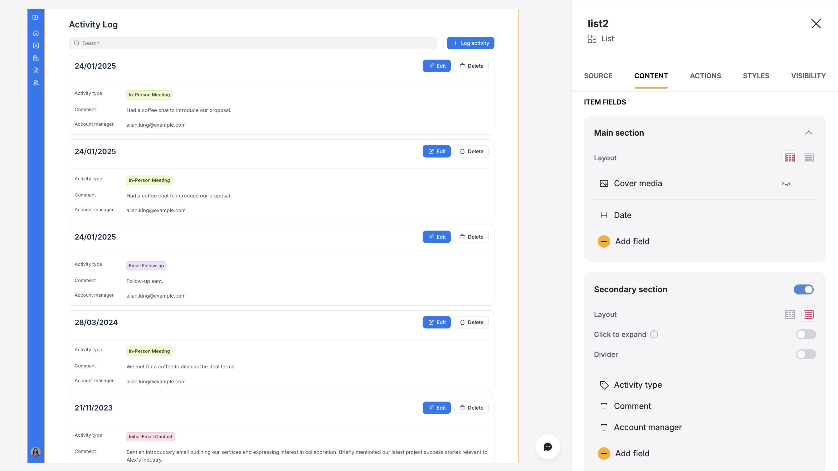 ### **Item fields**
**Item Fields** lets you connect fields from your **data source** to each list item, making it easy to display the information you need. You can control what information appears by adding, removing, or rearranging fields such as task names, assignees, or descriptions.
For each field in the **Item Fields** section of the secondary section, you can customize the following options:
* **Type:** Defines the display field type that controls how content appears in the block (e.g., text, checkbox, or image).
* **Content:** Chooses the specific data field from connected data sources to display.
* **Label (Optional):** Adds context to the field. If left blank, the label will not be visible to users.
### **Item fields**
**Item Fields** lets you connect fields from your **data source** to each list item, making it easy to display the information you need. You can control what information appears by adding, removing, or rearranging fields such as task names, assignees, or descriptions.
For each field in the **Item Fields** section of the secondary section, you can customize the following options:
* **Type:** Defines the display field type that controls how content appears in the block (e.g., text, checkbox, or image).
* **Content:** Chooses the specific data field from connected data sources to display.
* **Label (Optional):** Adds context to the field. If left blank, the label will not be visible to users.
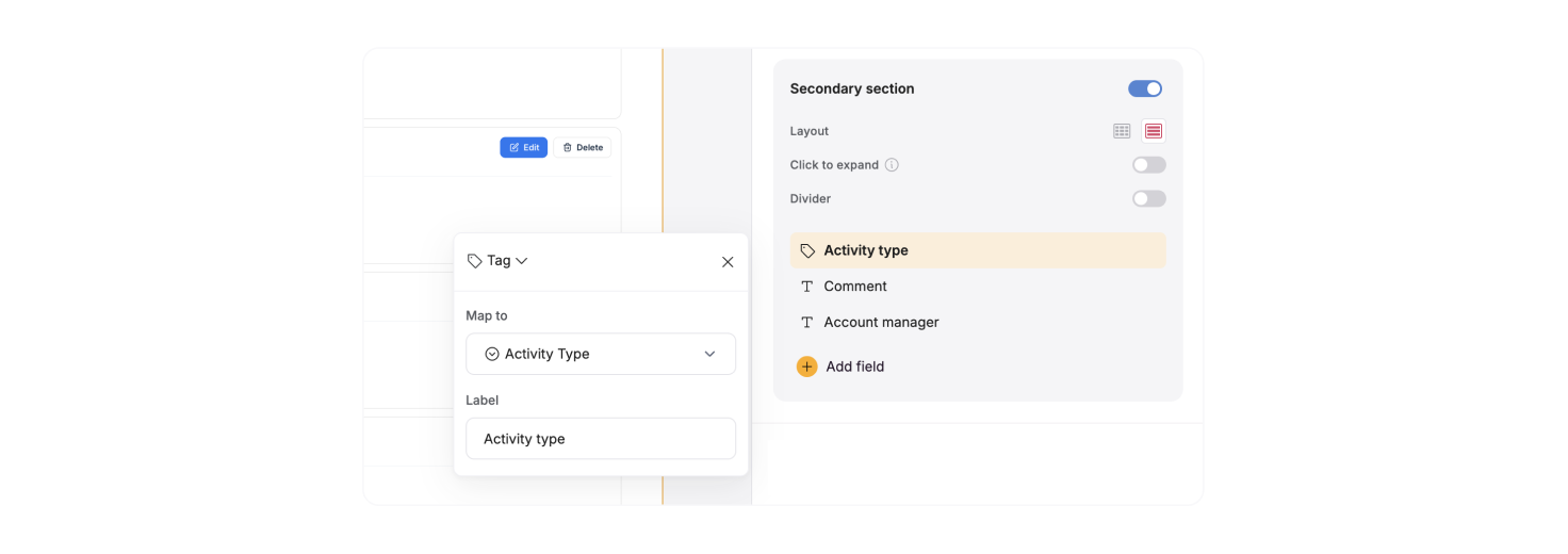 **Note:** Some display field types are compatible only with specific data formats. For example, if a field is set to display images, you cannot map it to text data. Ensure the field type matches your data source field format to avoid display issues.
**Supported field types**
| | |
| ----------------- | --------------------------------------------------------------------------------------------------------- |
| **Display Field** | **Description** |
| **Text** | Displays plain text. Ideal for names, titles, or short descriptions. |
| **Rich Text** | Supports long text, markdown, or HTML formatting. Allows for more detailed descriptions or notes. |
| **Headings** | Various heading sizes |
| **Email** | Displays email addresses as clickable mailto links, allowing users to start an email directly. |
| **URL** | Displays website links as clickable URLs, allowing users to navigate to external pages. |
| **Tag** | Allows you to display one or more tags, helpful for organizing items by category or status. |
| **File** | Provides a link for users to download attachments, such as PDFs or other documents. |
| **Video** | Embed video content from a supported source, allowing users to watch content directly in the block. |
| **Audio** | Embed audio files, letting users listen to content directly within the block. |
| **Image** | Displays a single image, useful for things like profile pictures or product images. |
| **Image gallery** | Displays multiple images in a gallery format, useful for showcasing a collection of visuals. |
| **Embed** | Allows you to embed content from other services, such as YouTube videos, Calendly, or social media posts. |
| **Rating** | Displays a rating system, typically with stars, to visually represent ratings or scores. |
| **Checkbox** | Shows a checkbox, useful for indicating completed items or allowing users to mark items as done. |
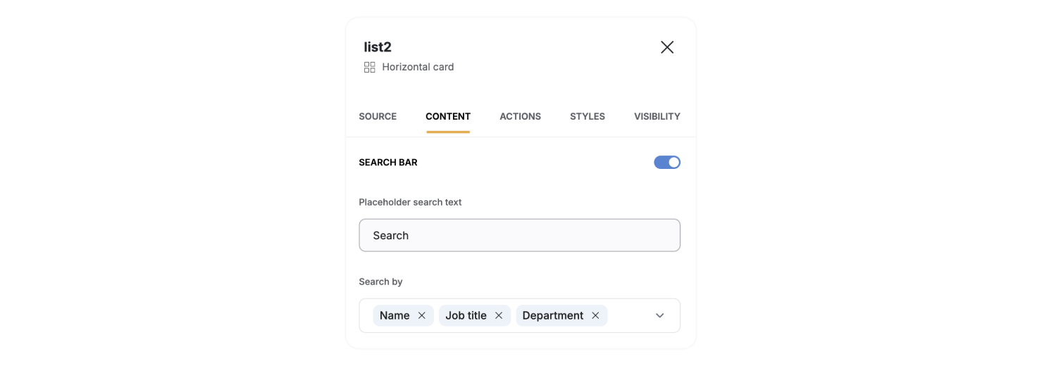
### **Search bar**
The **Search Bar** allows users to search through items in your block, making it easier to find specific entries quickly.
You can configure which parameters you want the search to be performed by adding fields to Search by input. For instance, if you’re displaying a list of employees, you might select “Name,” “Department,” and “Job title” as searchable fields.
**Note:** Some display field types are compatible only with specific data formats. For example, if a field is set to display images, you cannot map it to text data. Ensure the field type matches your data source field format to avoid display issues.
**Supported field types**
| | |
| ----------------- | --------------------------------------------------------------------------------------------------------- |
| **Display Field** | **Description** |
| **Text** | Displays plain text. Ideal for names, titles, or short descriptions. |
| **Rich Text** | Supports long text, markdown, or HTML formatting. Allows for more detailed descriptions or notes. |
| **Headings** | Various heading sizes |
| **Email** | Displays email addresses as clickable mailto links, allowing users to start an email directly. |
| **URL** | Displays website links as clickable URLs, allowing users to navigate to external pages. |
| **Tag** | Allows you to display one or more tags, helpful for organizing items by category or status. |
| **File** | Provides a link for users to download attachments, such as PDFs or other documents. |
| **Video** | Embed video content from a supported source, allowing users to watch content directly in the block. |
| **Audio** | Embed audio files, letting users listen to content directly within the block. |
| **Image** | Displays a single image, useful for things like profile pictures or product images. |
| **Image gallery** | Displays multiple images in a gallery format, useful for showcasing a collection of visuals. |
| **Embed** | Allows you to embed content from other services, such as YouTube videos, Calendly, or social media posts. |
| **Rating** | Displays a rating system, typically with stars, to visually represent ratings or scores. |
| **Checkbox** | Shows a checkbox, useful for indicating completed items or allowing users to mark items as done. |
### **Search bar**
The **Search Bar** allows users to search through items in your block, making it easier to find specific entries quickly.
You can configure which parameters you want the search to be performed by adding fields to Search by input. For instance, if you’re displaying a list of employees, you might select “Name,” “Department,” and “Job title” as searchable fields.
 If no fields are selected, the search bar will display all items regardless of the search term. To ensure meaningful search results, always select at least one field.
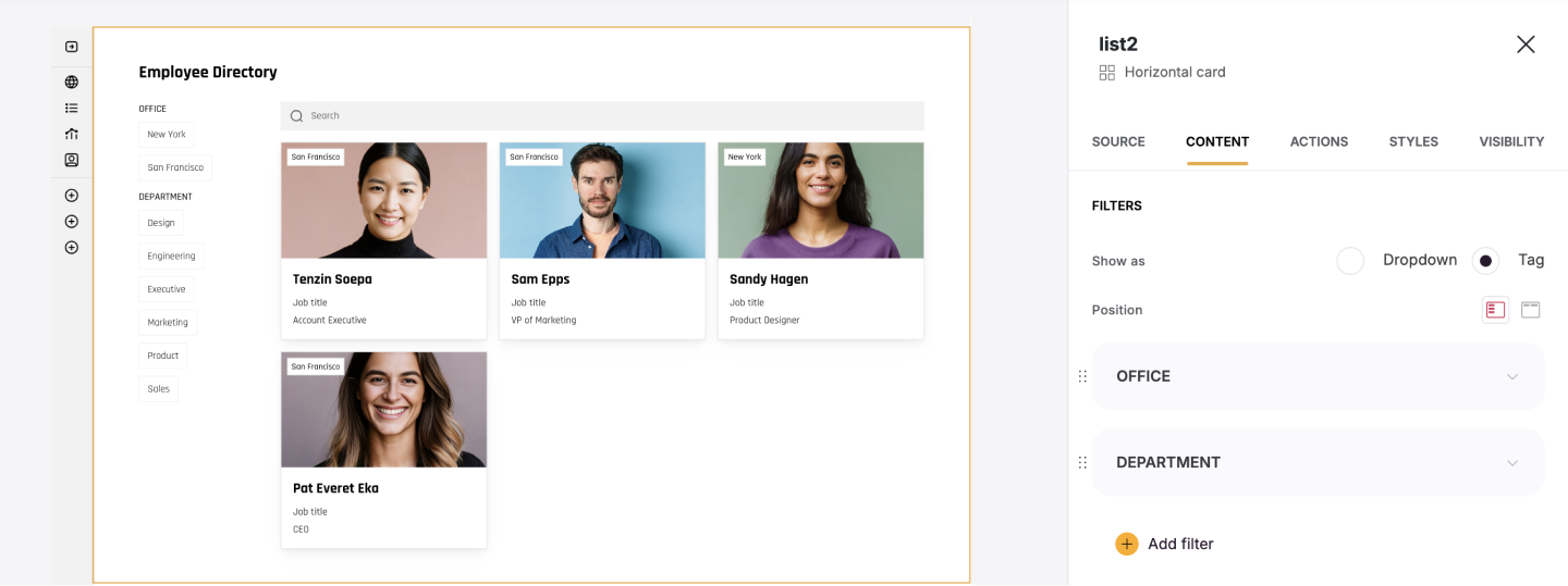
### **Filters**
Filters allow your app users to narrow down list items based on specific fields, making it easier to find what they need without scrolling through all the items. You can set up one or more filters in the block to enhance user search functionality.
Choose between a **Dropdown** menu (collapsible for large option sets) or **Tags** (clickable labels for frequently used categories). Depending on your layout needs, decide where filters will appear—at the t**op** or **Left** of the block.
If no fields are selected, the search bar will display all items regardless of the search term. To ensure meaningful search results, always select at least one field.
### **Filters**
Filters allow your app users to narrow down list items based on specific fields, making it easier to find what they need without scrolling through all the items. You can set up one or more filters in the block to enhance user search functionality.
Choose between a **Dropdown** menu (collapsible for large option sets) or **Tags** (clickable labels for frequently used categories). Depending on your layout needs, decide where filters will appear—at the t**op** or **Left** of the block.
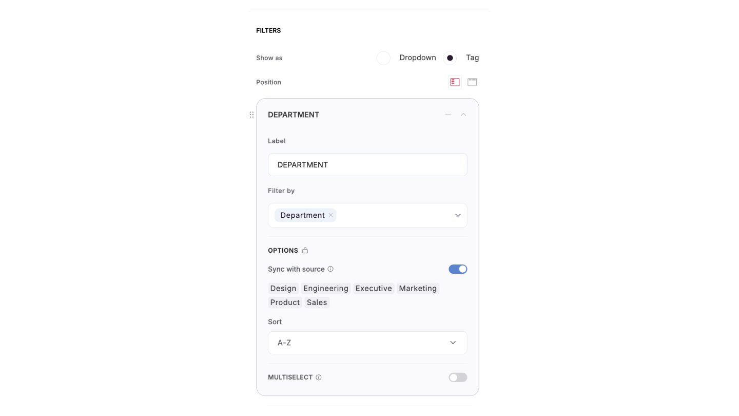
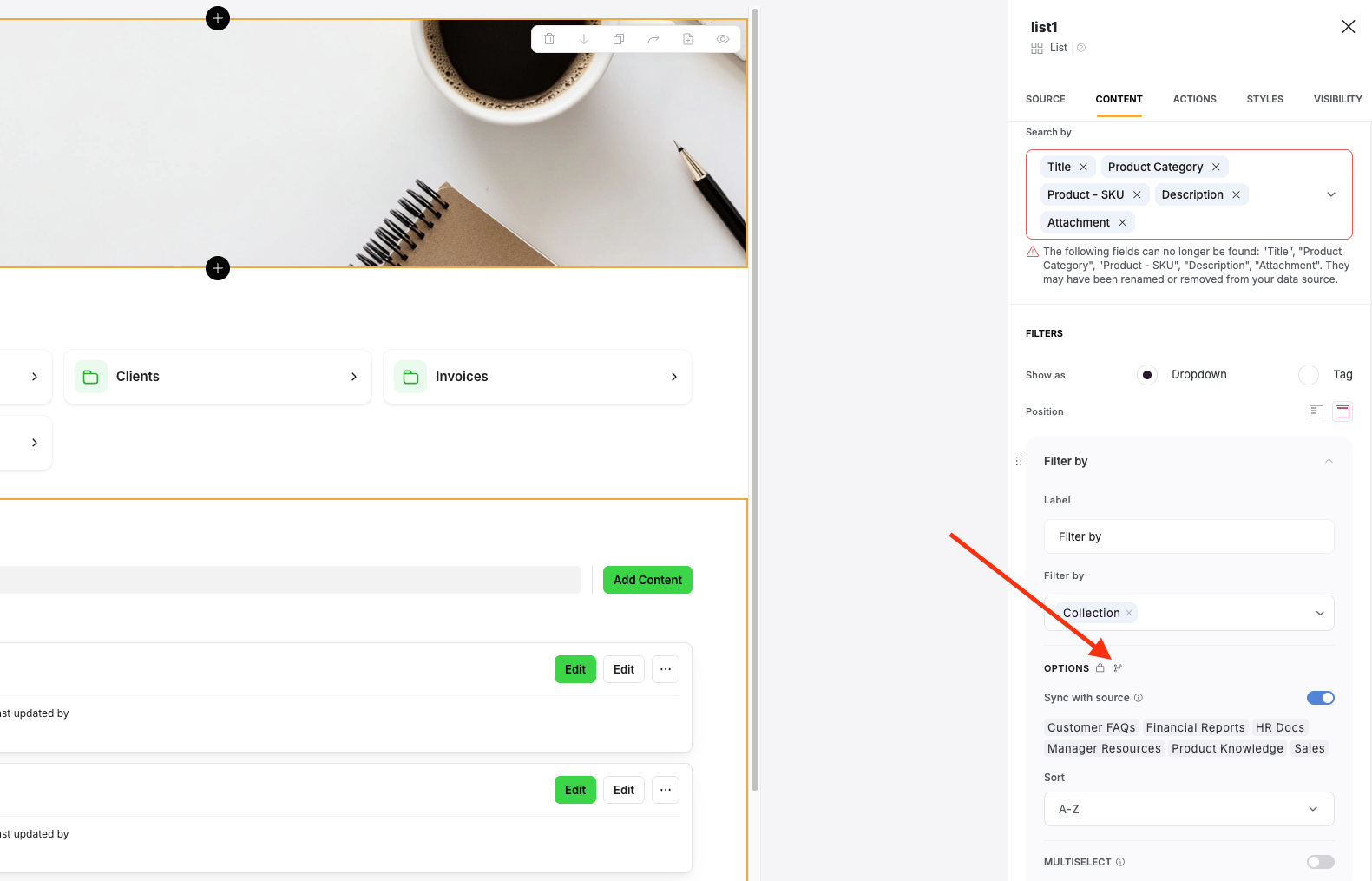
 For each filter, you can configure:
* **Label**: Add a descriptive label to guide users, such as **"Filter by Status"** or **"Filter by Category**.”
* **Field**: Select the data field users can filter by, such as **Status**, **Category**, or **Language**.
* **Options**: Define the values users can select in the filter.
* **When Sync with Data Source is Enabled,** the filter options automatically pull all available values from your data source. You can then select which of these synced values to display in the filter, making it easy to keep options updated while retaining customization. \*This feature is only available for specific field types, such as **single-select**, **multi-select**, and **linked record** fields.
* **When Sync is Disabled**: You must manually define and update the filter options. This allows full control over which values appear but requires manual changes whenever your data is updated.
* **Sorting Options**: You can arrange filter options alphabetically (**A-Z** or **Z-A**) or in a custom order based on relevance.
* **Multi-select (Optional):** This option allows users to select multiple filter options at a time. It is useful when filtering by multiple categories, statuses, or other fields simultaneously.
For each filter, you can configure:
* **Label**: Add a descriptive label to guide users, such as **"Filter by Status"** or **"Filter by Category**.”
* **Field**: Select the data field users can filter by, such as **Status**, **Category**, or **Language**.
* **Options**: Define the values users can select in the filter.
* **When Sync with Data Source is Enabled,** the filter options automatically pull all available values from your data source. You can then select which of these synced values to display in the filter, making it easy to keep options updated while retaining customization. \*This feature is only available for specific field types, such as **single-select**, **multi-select**, and **linked record** fields.
* **When Sync is Disabled**: You must manually define and update the filter options. This allows full control over which values appear but requires manual changes whenever your data is updated.
* **Sorting Options**: You can arrange filter options alphabetically (**A-Z** or **Z-A**) or in a custom order based on relevance.
* **Multi-select (Optional):** This option allows users to select multiple filter options at a time. It is useful when filtering by multiple categories, statuses, or other fields simultaneously.
 **Filtering the Filter Options**
You can also filter the filter options to display different options based on user attributes, selected records, etc. Just click on the branching icon next to the Options subtitle:
**Filtering the Filter Options**
You can also filter the filter options to display different options based on user attributes, selected records, etc. Just click on the branching icon next to the Options subtitle:
 Then toggle it on and setup the conditions you want to apply to filter to the filter.
 ### **Embed Block**
You can embed any Softr block in another application. Learn how in our [Page and Block Embed](/application-settings/n3K2UEfpC9BpHgakMzUU5Y/page-and-block-embed/kaMvDCneGdx43AxHnmf7bm) guide.
## Actions
[Actions](/core-concepts-overview/c5VwEbsWtTfPyUZjmEKvfx/actions-adding-and-editing-data-/41p6U2eZs87asLz6dV5AMy) let you define what happens when users interact with a block, such as navigating to a new page, editing records, or triggering workflows. This ensures your app not only displays data but also offers dynamic user engagement.
### **Embed Block**
You can embed any Softr block in another application. Learn how in our [Page and Block Embed](/application-settings/n3K2UEfpC9BpHgakMzUU5Y/page-and-block-embed/kaMvDCneGdx43AxHnmf7bm) guide.
## Actions
[Actions](/core-concepts-overview/c5VwEbsWtTfPyUZjmEKvfx/actions-adding-and-editing-data-/41p6U2eZs87asLz6dV5AMy) let you define what happens when users interact with a block, such as navigating to a new page, editing records, or triggering workflows. This ensures your app not only displays data but also offers dynamic user engagement.
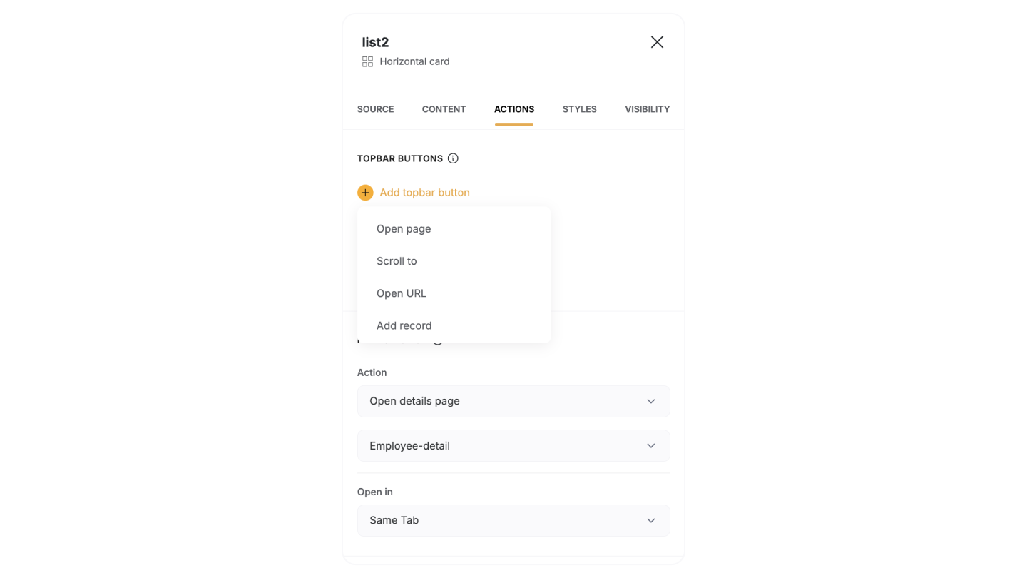 **Topbar buttons**
* [Add record](/actions/ntEfT9zSJk6aY54G6W5KGU/add-record/3LrUMpQY4BKfDDQj6eb8h8): Create new entries in your data.
* [Open page](/actions/ntEfT9zSJk6aY54G6W5KGU/item-on-click-actions/f1ns7phZfNNvgwXA6tTN3M): Navigate to another page within your app.
* **Open URL**: Redirect users to an external link.
* **Scroll to**: Move the view to a specific section within the block.
* [Export](/actions/ntEfT9zSJk6aY54G6W5KGU/export/mnrvzncWeoSfwWJscZCAxC):Export visible records.
**Item buttons**
* [Edit record](/actions/ntEfT9zSJk6aY54G6W5KGU/edit-record/irSJXPF1gCMXNmfsQFscvx): Modify the details of a specific record.
* [One-Click Update](/actions/ntEfT9zSJk6aY54G6W5KGU/one-click-update/8BaX5i6KLZhZCrSZERGnej): Apply predefined updates to a record with a single click.
* [Open details page](/actions/ntEfT9zSJk6aY54G6W5KGU/item-on-click-actions/f1ns7phZfNNvgwXA6tTN3M): Open the details page of the selected record.
* [Delete Record](/actions/ntEfT9zSJk6aY54G6W5KGU/delete-record/peV9LGdJbM9sKHKynqopkH): Remove a record from your data.
* **Open URL**: Redirect users to an external link.
* [Download file](/actions/ntEfT9zSJk6aY54G6W5KGU/download-file/8Sr2y4CREVcW2GEEDYUhfJ): Provide users with a direct option to download associated files.
* [Call API](/actions/ntEfT9zSJk6aY54G6W5KGU/call-api/i9f1s3w9wib3oRmS4HZ7MX): This action triggers a custom API call for advanced integrations (*available for Professional, Business, and Enterprise plans).*
**On Click Actions:**
* **Do nothing:** Nothing happens when the user clicks on the item.
* **Open URL**: Redirect users to an external link.
* **Scroll to**: Move the view to a specific section within the block.
* **Open details page**: Open the details page of the selected record.
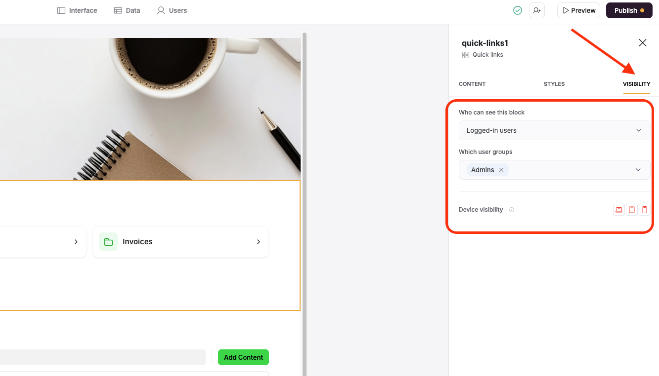
## Visibility
Control who can see a block by setting up [visibility](/user-groups-and-permissions/3oA6AaFzUiePs2sW2TpYrF/block-visibility/3spA2dfQNrcGcPNmnDXHB3) rules. This helps tailor the user experience by showing relevant content to the right audience, improving personalization and security.
**Topbar buttons**
* [Add record](/actions/ntEfT9zSJk6aY54G6W5KGU/add-record/3LrUMpQY4BKfDDQj6eb8h8): Create new entries in your data.
* [Open page](/actions/ntEfT9zSJk6aY54G6W5KGU/item-on-click-actions/f1ns7phZfNNvgwXA6tTN3M): Navigate to another page within your app.
* **Open URL**: Redirect users to an external link.
* **Scroll to**: Move the view to a specific section within the block.
* [Export](/actions/ntEfT9zSJk6aY54G6W5KGU/export/mnrvzncWeoSfwWJscZCAxC):Export visible records.
**Item buttons**
* [Edit record](/actions/ntEfT9zSJk6aY54G6W5KGU/edit-record/irSJXPF1gCMXNmfsQFscvx): Modify the details of a specific record.
* [One-Click Update](/actions/ntEfT9zSJk6aY54G6W5KGU/one-click-update/8BaX5i6KLZhZCrSZERGnej): Apply predefined updates to a record with a single click.
* [Open details page](/actions/ntEfT9zSJk6aY54G6W5KGU/item-on-click-actions/f1ns7phZfNNvgwXA6tTN3M): Open the details page of the selected record.
* [Delete Record](/actions/ntEfT9zSJk6aY54G6W5KGU/delete-record/peV9LGdJbM9sKHKynqopkH): Remove a record from your data.
* **Open URL**: Redirect users to an external link.
* [Download file](/actions/ntEfT9zSJk6aY54G6W5KGU/download-file/8Sr2y4CREVcW2GEEDYUhfJ): Provide users with a direct option to download associated files.
* [Call API](/actions/ntEfT9zSJk6aY54G6W5KGU/call-api/i9f1s3w9wib3oRmS4HZ7MX): This action triggers a custom API call for advanced integrations (*available for Professional, Business, and Enterprise plans).*
**On Click Actions:**
* **Do nothing:** Nothing happens when the user clicks on the item.
* **Open URL**: Redirect users to an external link.
* **Scroll to**: Move the view to a specific section within the block.
* **Open details page**: Open the details page of the selected record.
## Visibility
Control who can see a block by setting up [visibility](/user-groups-and-permissions/3oA6AaFzUiePs2sW2TpYrF/block-visibility/3spA2dfQNrcGcPNmnDXHB3) rules. This helps tailor the user experience by showing relevant content to the right audience, improving personalization and security.
 ## Style
Customize the look and feel of your blocks with s[tyling](/core-concepts-overview/c5VwEbsWtTfPyUZjmEKvfx/style-your-app/41p6U2eZs8AZmBW8mHykXA) options. Adjust fonts, colors, spacing, and more to align with your app’s branding and create a polished, professional design.
## Style
Customize the look and feel of your blocks with s[tyling](/core-concepts-overview/c5VwEbsWtTfPyUZjmEKvfx/style-your-app/41p6U2eZs8AZmBW8mHykXA) options. Adjust fonts, colors, spacing, and more to align with your app’s branding and create a polished, professional design.
 ## Relevant Guides
* [How to set up a record detail page?](/building-blocks/vikC2AWEpQGkZd4jGyoVxo/item-details-block-/4bE8XaFbJp45wkAwuWiz8f)
* [How to filter list records by Page URL parameter?](/how-to-guides/ioi5BbuQ2RDM7aHPrpXnjG/how-to-filter-list-by-page-url-parameters/42JZoeYwMstwaL9aoBdRjz)
## Relevant Guides
* [How to set up a record detail page?](/building-blocks/vikC2AWEpQGkZd4jGyoVxo/item-details-block-/4bE8XaFbJp45wkAwuWiz8f)
* [How to filter list records by Page URL parameter?](/how-to-guides/ioi5BbuQ2RDM7aHPrpXnjG/how-to-filter-list-by-page-url-parameters/42JZoeYwMstwaL9aoBdRjz)