> ## Documentation Index
> Fetch the complete documentation index at: https://docs.softr.io/llms.txt
> Use this file to discover all available pages before exploring further.
# Header
> The main features of the Header block.
The header area of the site is usually used to display the navigation bar, logo, signin/signup , and can include other functionality depending on the nature of the site. Softr has several header layouts with different types of links and buttons that can be customized according to your requirements.
# Common Header Features
## Logo
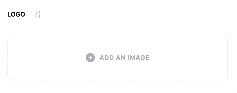
All the Header block layouts have a **Logo** field that can be removed or changed by clicking on it. You can upload an image or choose one from the library.
 ## Buttons and links
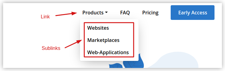
Apart from the logo, there are **Buttons** and **Links**, which can also have **Sublinks** that appear within a dropdown opened when hovering over or clicking the link. Each layout has certain links and buttons by default, but you can add as many as you wish.
## Buttons and links
Apart from the logo, there are **Buttons** and **Links**, which can also have **Sublinks** that appear within a dropdown opened when hovering over or clicking the link. Each layout has certain links and buttons by default, but you can add as many as you wish.
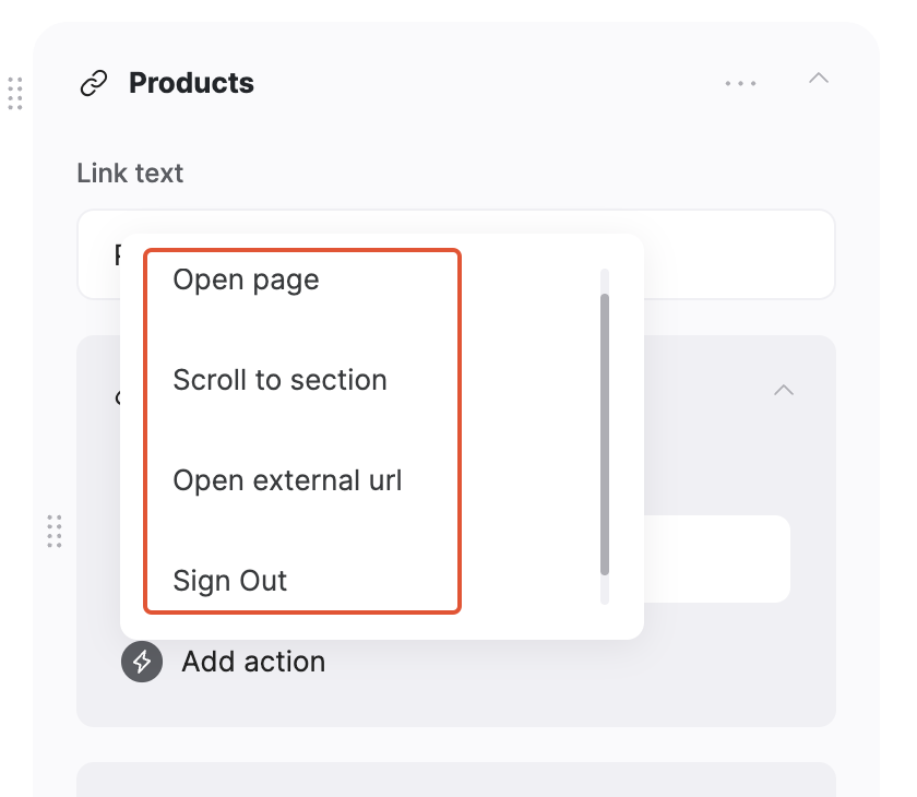
 The links have a text area to enter the link name and an **Add action** button to specify what the link does. The action can be set to **Open Page, Scroll to section**, **Open external url,** or **Sign out**
 A **Sublink** can be added to the link by clicking the **Add sublink** option.
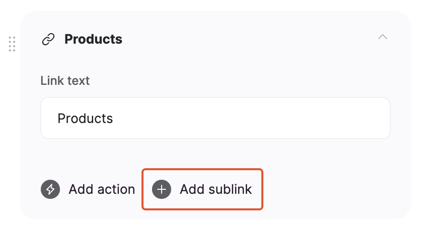 After adding a **Sublink**, the **Add action** option of the link becomes unavailable, as its only action now is to display the sublinks. Sublinks are configured similar to Links.
**Buttons** have a configuration similar to that of **Links**. The only difference is the visual layout.
## Show User Profile
This option is typically used to show a user profile icon with a dropdown to logged-in users. By default, you have the **Sign Out** and **My Profile** links, but you can add as many additional options as needed as well as remove the default ones.
After adding a **Sublink**, the **Add action** option of the link becomes unavailable, as its only action now is to display the sublinks. Sublinks are configured similar to Links.
**Buttons** have a configuration similar to that of **Links**. The only difference is the visual layout.
## Show User Profile
This option is typically used to show a user profile icon with a dropdown to logged-in users. By default, you have the **Sign Out** and **My Profile** links, but you can add as many additional options as needed as well as remove the default ones.
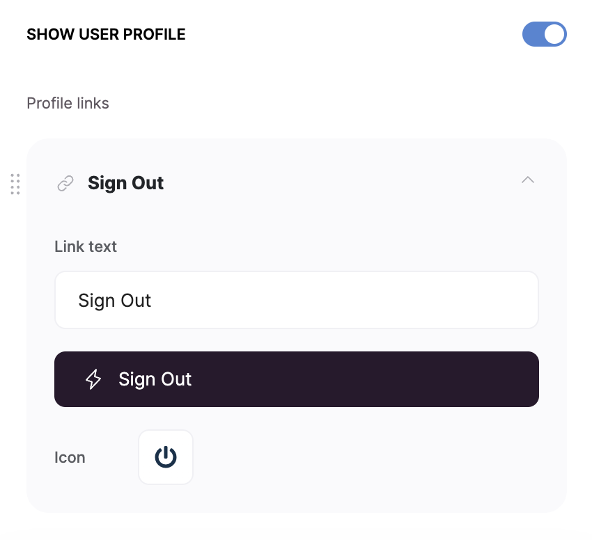 You can see how this option is applied in [this tutorial](/11ba304436ed4354a8669d4869624b9c) on setting up Memberships.
## Sticky Header
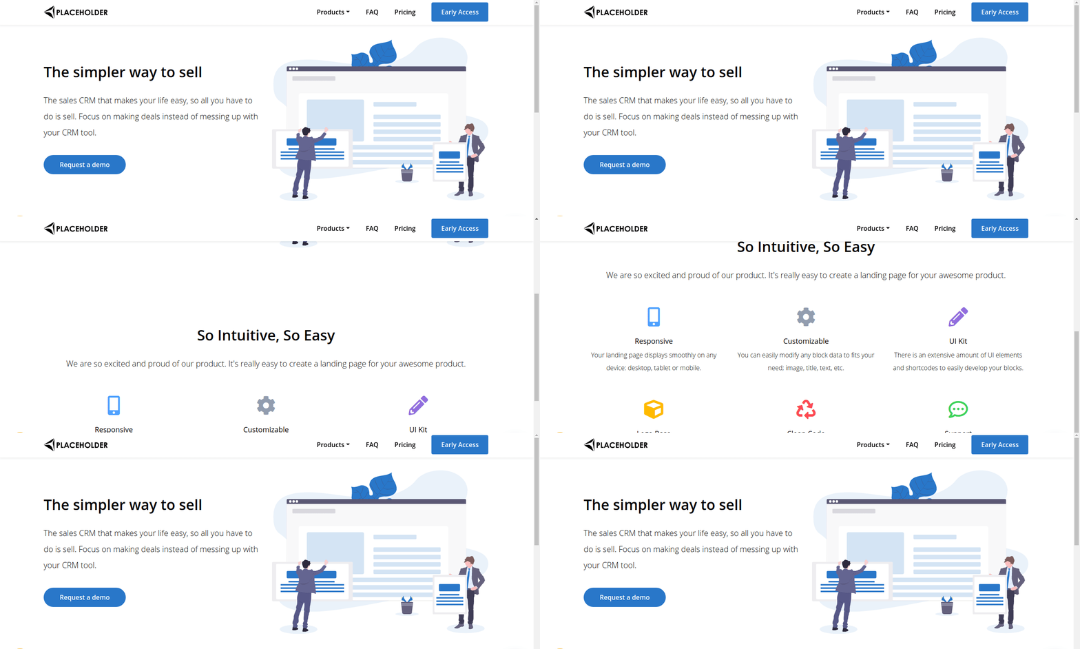
Lastly, there is the **Always show the header on top of the screen** option. When enabled, the header will become sticky and will stay on the screen when scrolling down.
You can see how this option is applied in [this tutorial](/11ba304436ed4354a8669d4869624b9c) on setting up Memberships.
## Sticky Header
Lastly, there is the **Always show the header on top of the screen** option. When enabled, the header will become sticky and will stay on the screen when scrolling down.
 That's it for the overview. You can explore each layout in greater detail in the subsections to this article.
# Header Layouts
## Header with sublinks and button
That's it for the overview. You can explore each layout in greater detail in the subsections to this article.
# Header Layouts
## Header with sublinks and button
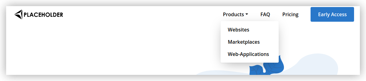 This layout has a button and several **Links**, one of which has **Sublinks**. The dropdown with **Sublinks** opens on click.
## Header with links and buttons
This layout has a button and several **Links**, one of which has **Sublinks**. The dropdown with **Sublinks** opens on click.
## Header with links and buttons
 This layout has several **Links** and two **Buttons**, which are meant as **Sign In**
and **Sign Up** buttons but can also be customized to serve a different purpose.
## Header with hamburger menu
This layout has several **Links** and two **Buttons**, which are meant as **Sign In**
and **Sign Up** buttons but can also be customized to serve a different purpose.
## Header with hamburger menu
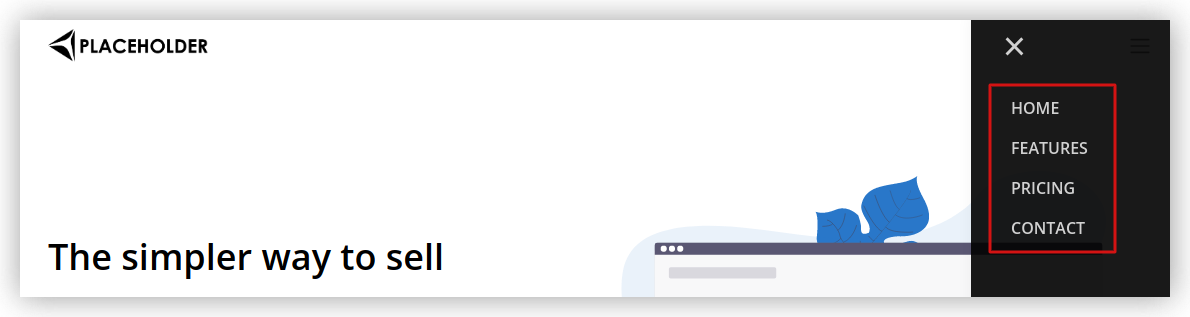
 In this layout, the **Link** items appear under the hamburger menu. Here you can add **Links** only (no **Buttons**), and they will all appear within the hamburger menu, as shown below.
 ## Header with sublinks, icon and description
 This layout has an option to add an **Icon** and **Description** to **Sublinks**, which appear when hovering over the parent link, as shown above.
In the screenshot below, you can see what the icon and description configuration looks like.
This layout has an option to add an **Icon** and **Description** to **Sublinks**, which appear when hovering over the parent link, as shown above.
In the screenshot below, you can see what the icon and description configuration looks like.
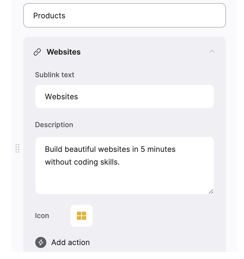 The **Icon** image can be customized by clicking on it and either uploading a new image or choosing one from the library. The **Description** is a text area, where you can add longer texts with multiple lines to describe the item.